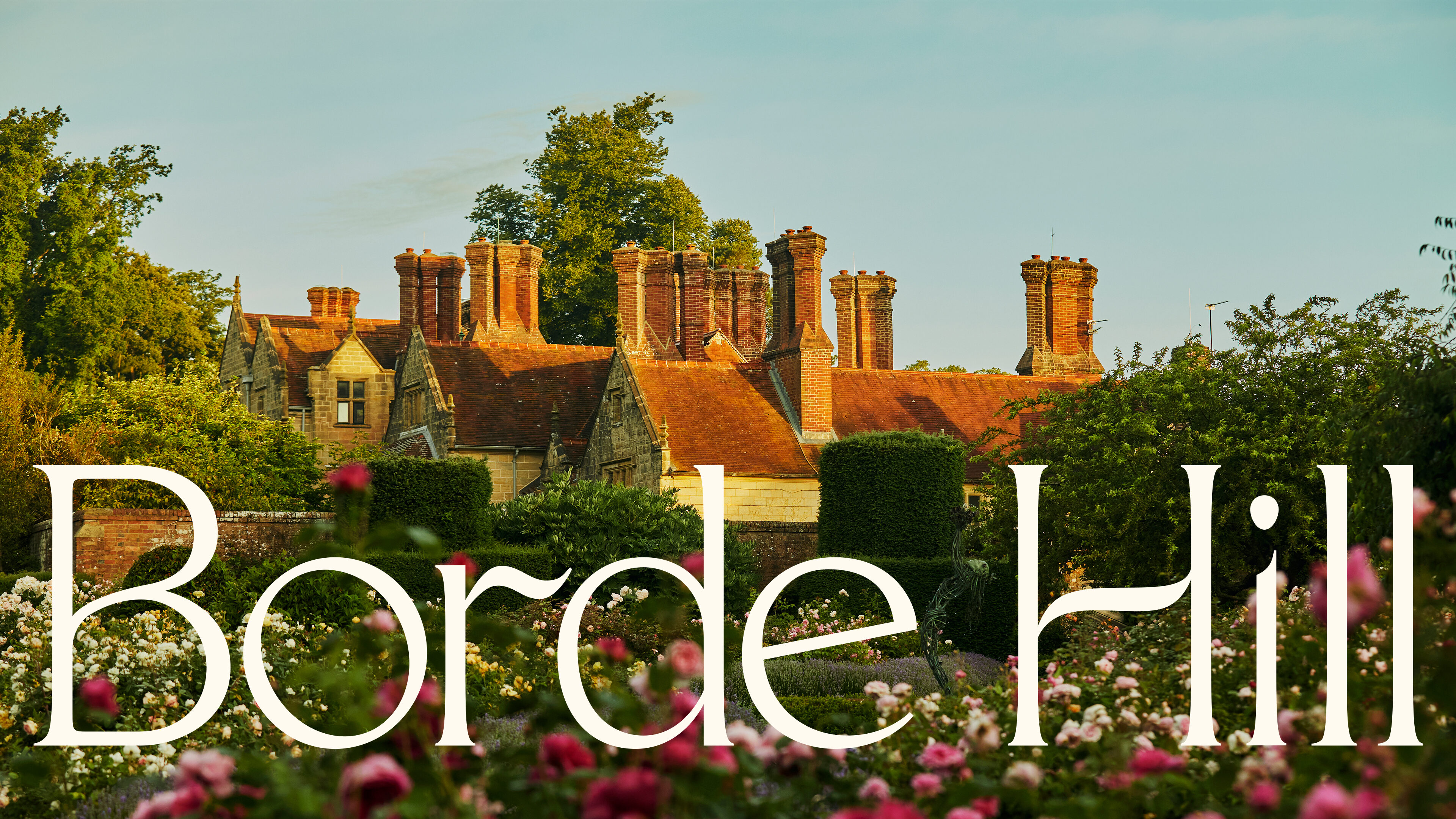
We partnered with family-run Borde Hill at a key moment in their history, one of reinvention. Growing as a nationally important English country garden, cultural institution and aspirational destination, with the ambition of connecting communities with the restorative power of nature.
Creating an identity across the estate that reflects their astonishing natural heritage and progressive future vision.
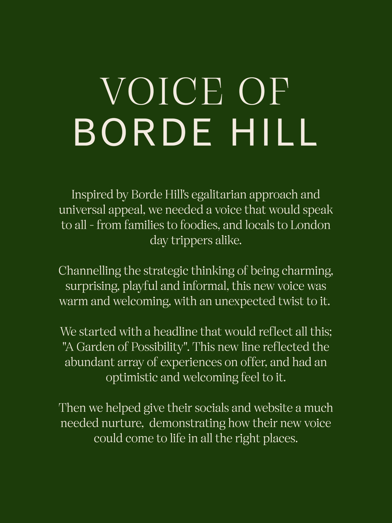
The strategic and creative challenge was a central idea and design relevant to a broad audience – to school children, local community growers and hospitality guests alike. At once, egalitarian and aspirational.
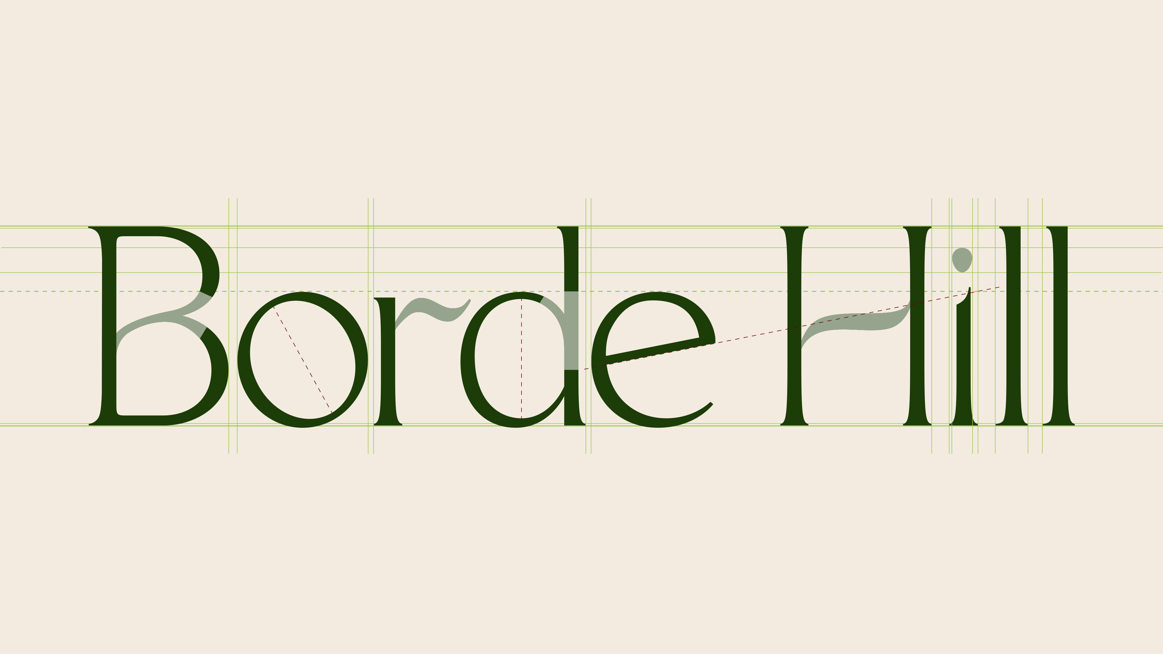
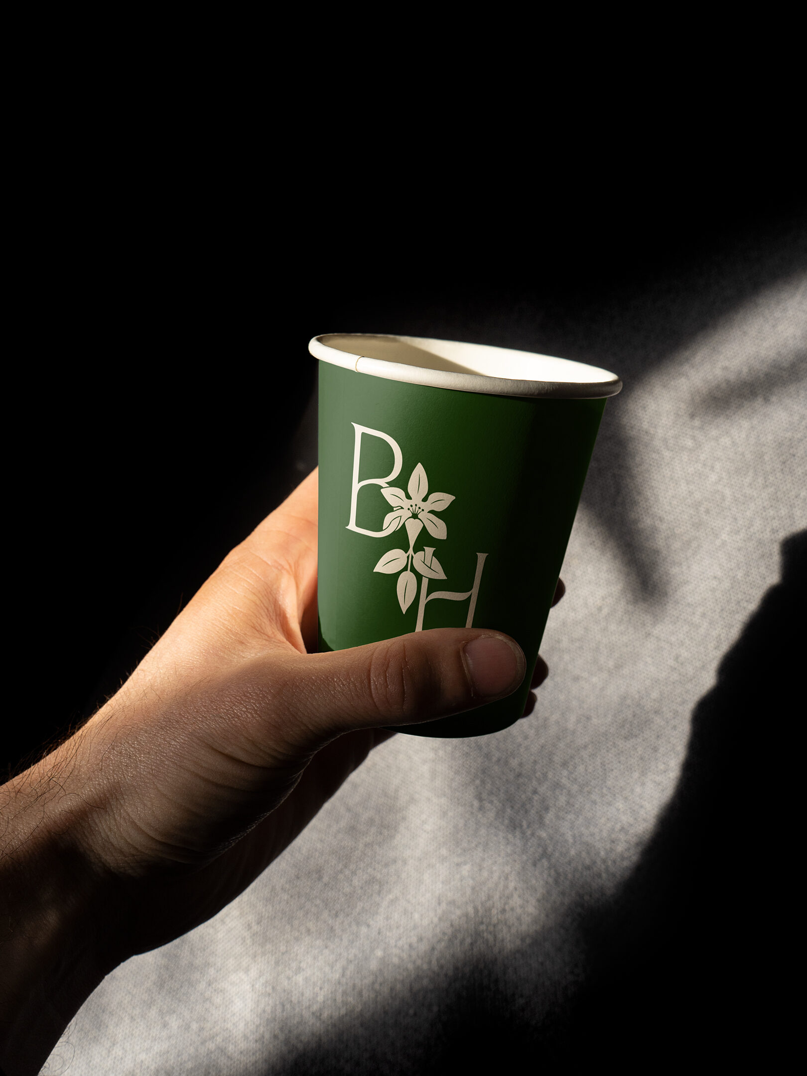
The design of the logotype was inspired by nature, looking at the form of leaves and stems. We crafted each of the characters using contrasting widths to add a sense of rhythm and growth. The dot of the 'i' is a subtle nod to a seed, bringing moments of joy to the brand. Wide, open counters add elegance and lightness, while the short serifs help the word mark feel grounded yet contemporary.
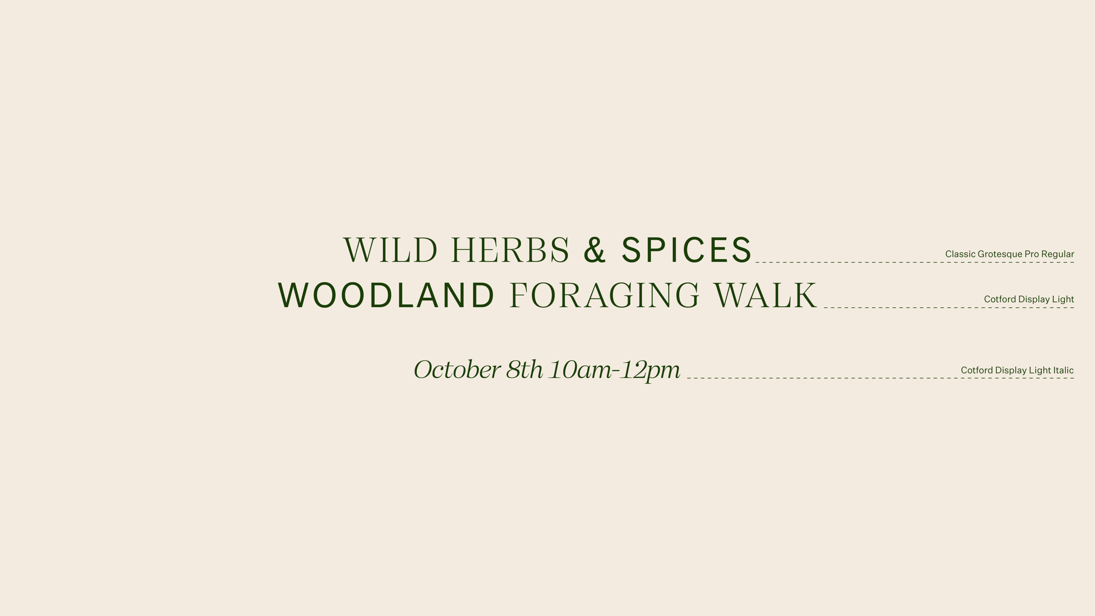
We use a mix of serif and sans-serif typefaces, bridging the past with the present. Our natural heritage and bold progressive vision - an ongoing story.
Cotford is a contemporary serif where the letterforms feel delicate yet rooted, bending and reaching like flower stems. Its characteristics are not too dissimilar to a typewriter font, a style that is evident on ephemera in the Borde Hill archive.
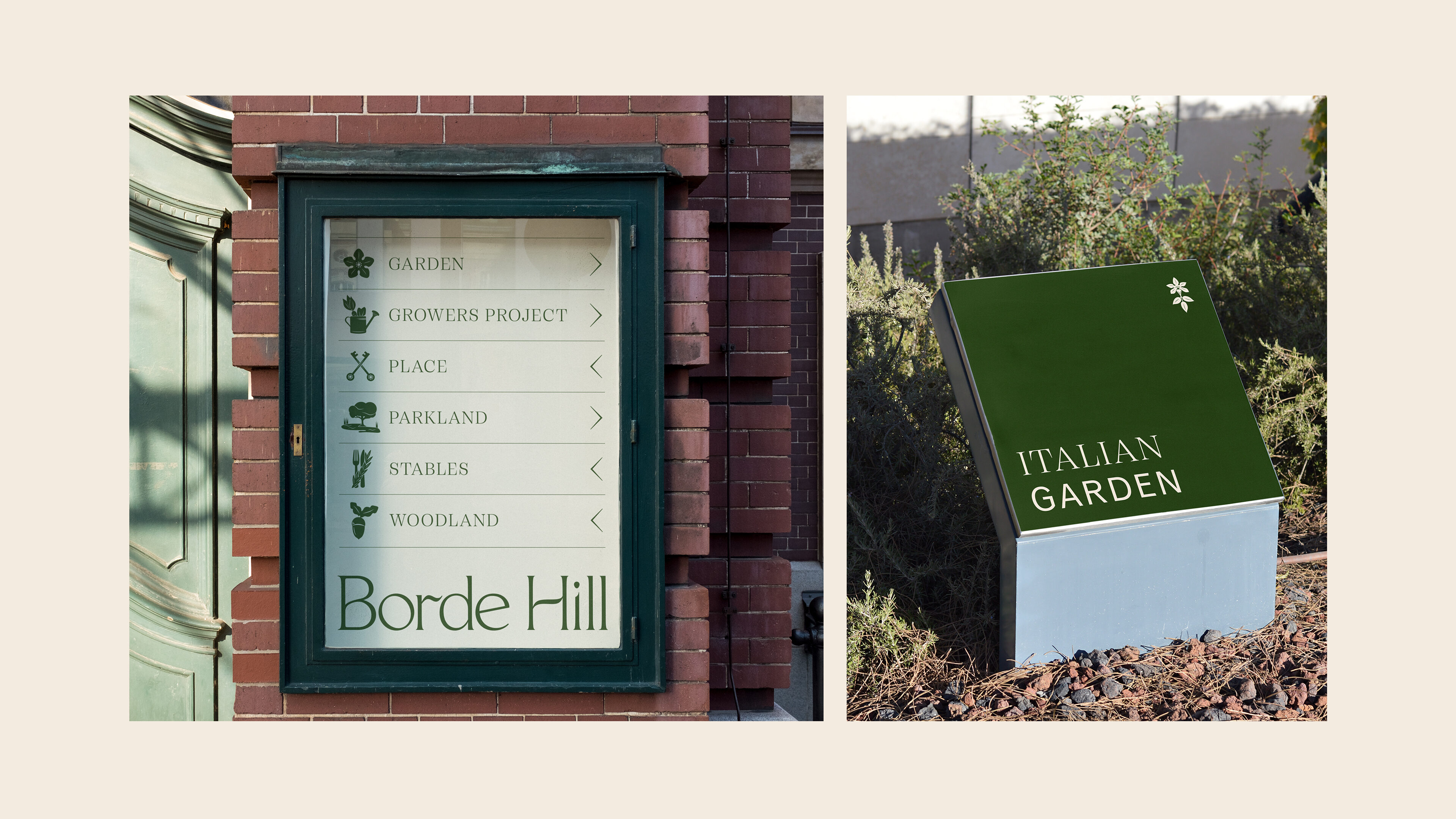
We created a set of graphic icons to represent each of the six areas within Borde Hill. Leaning in to the graphic language of the monogram, we weaved in subtle nods towards the Henryii, such as the detail in the keys and flower icon.
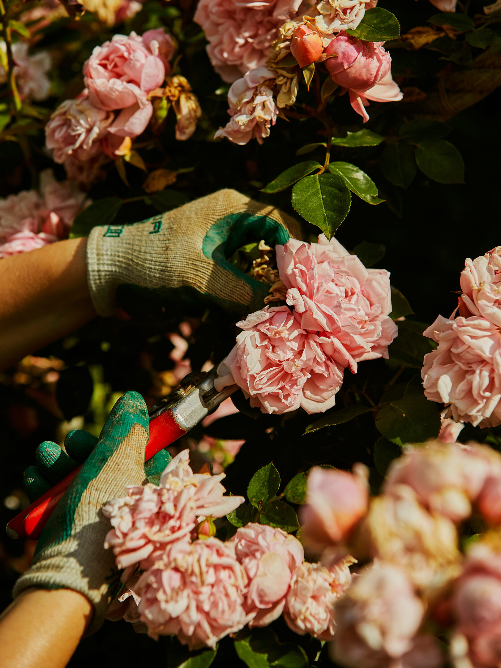
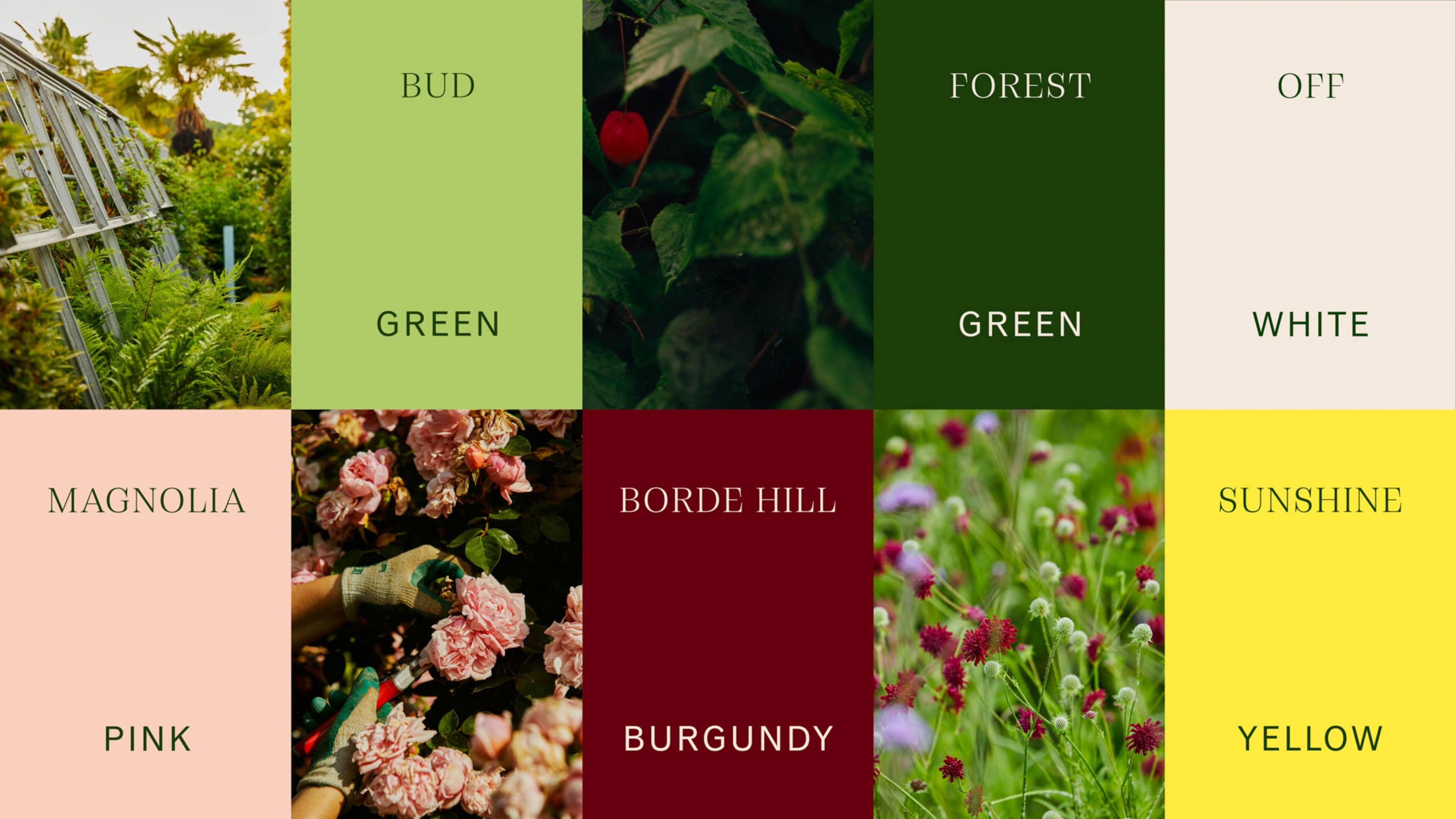
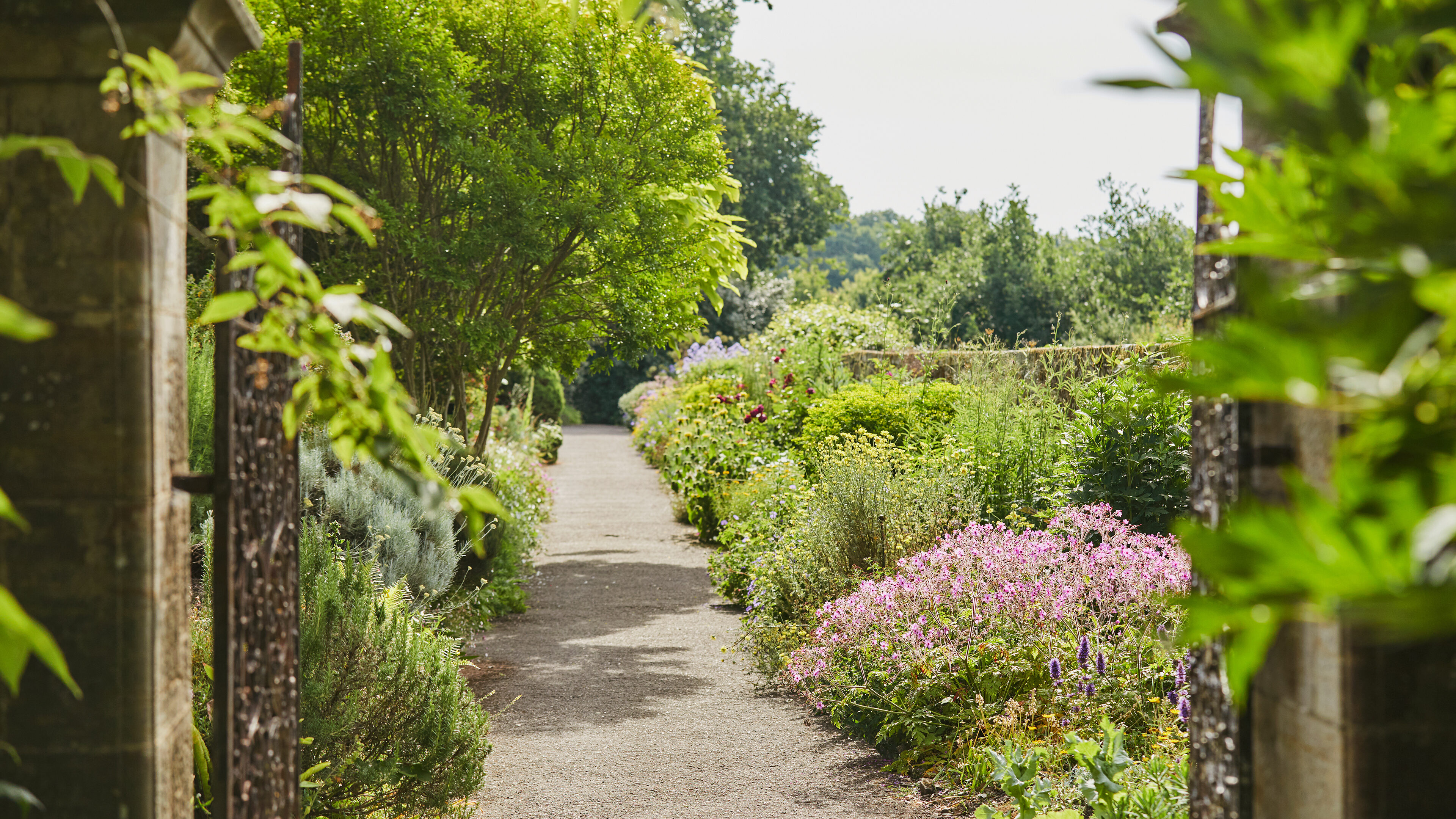
Photography: Emli Bendixen
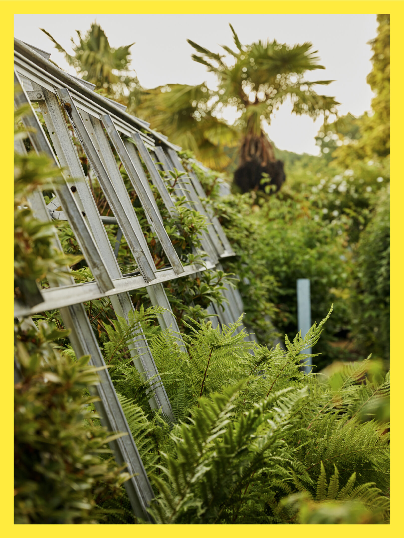
Photography: Emli Bendixen
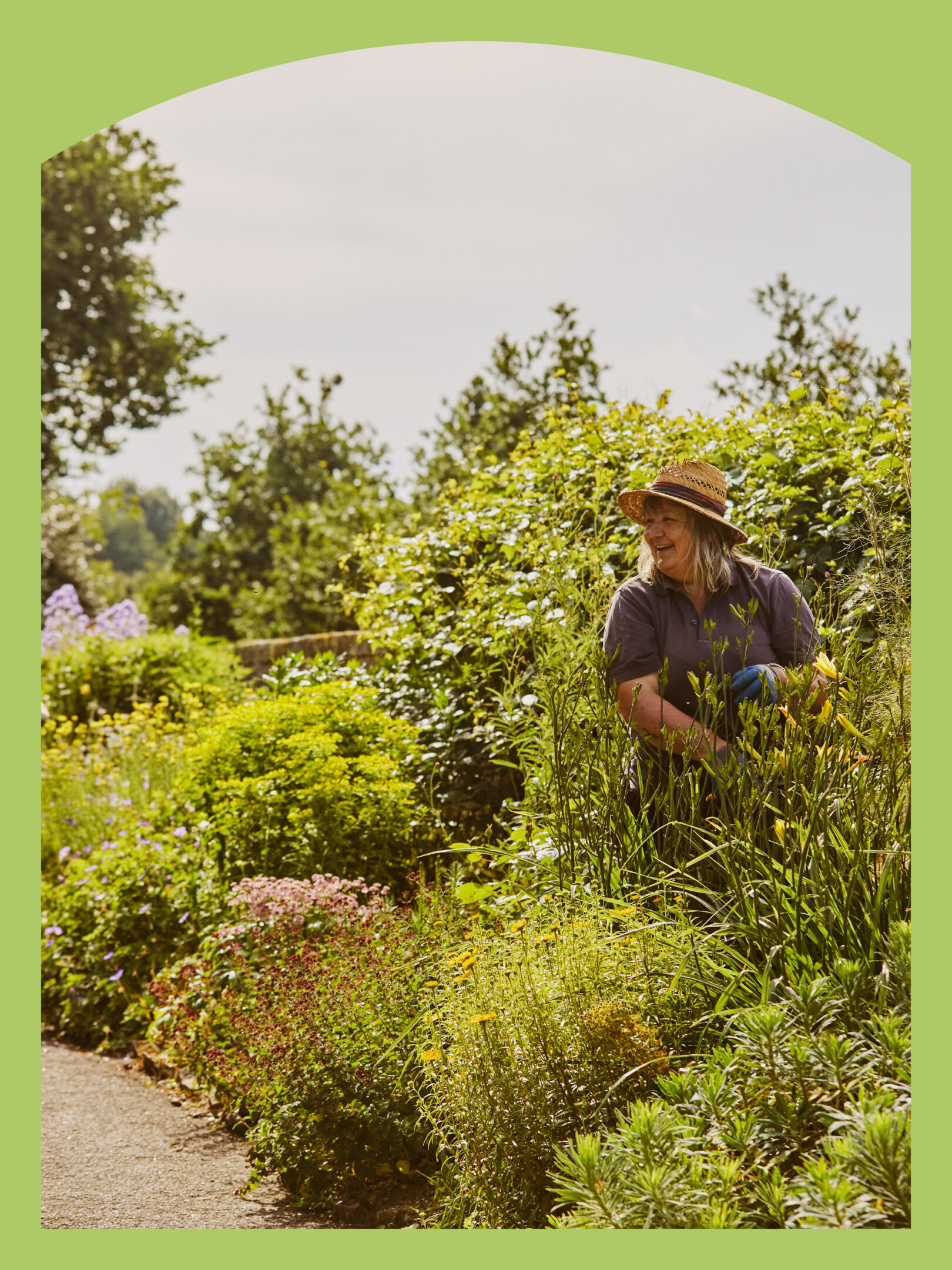
Using a simple framing device for imagery, we took our inspiration from the window and door shapes of the Borde Hill estate.