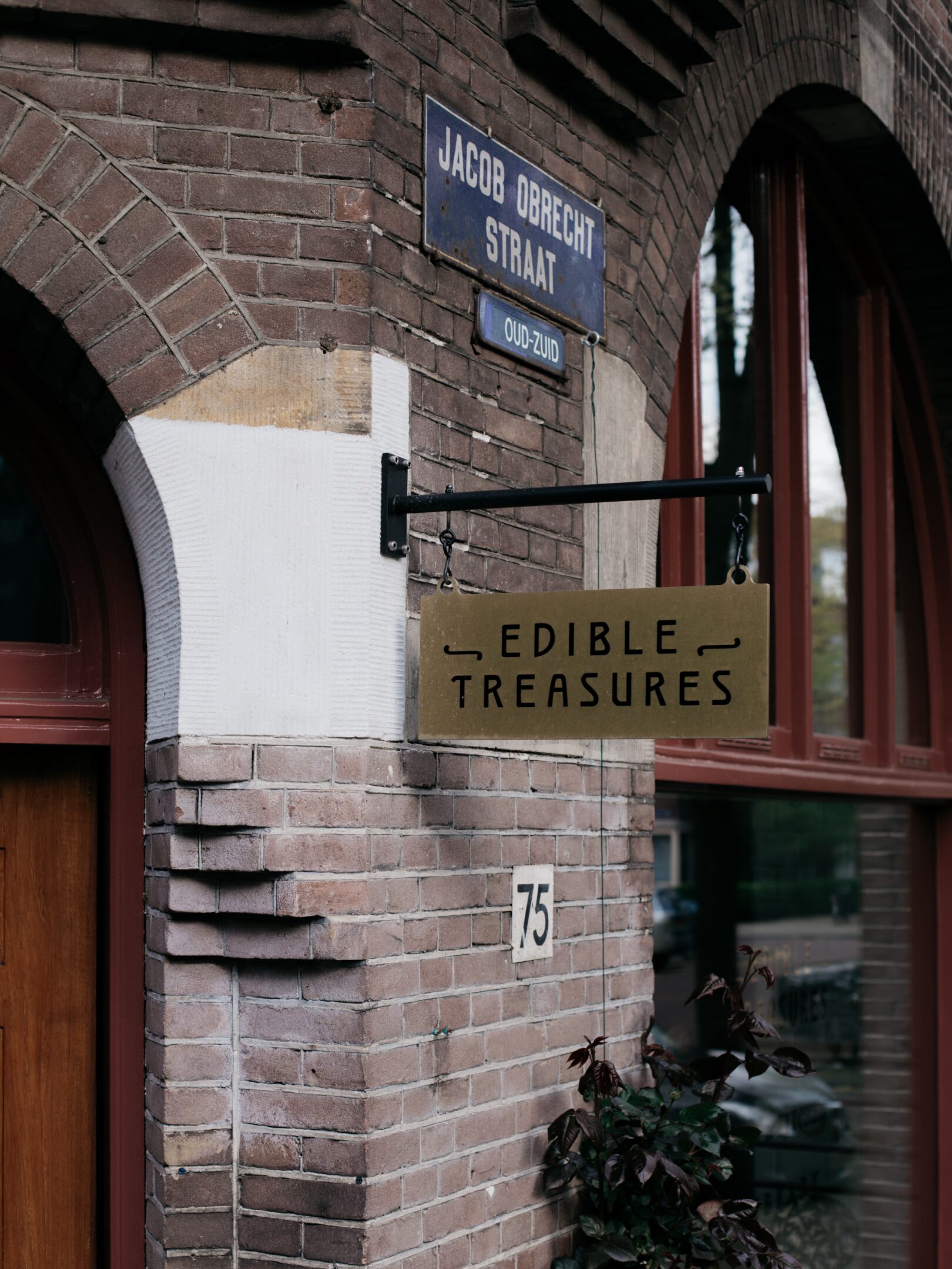
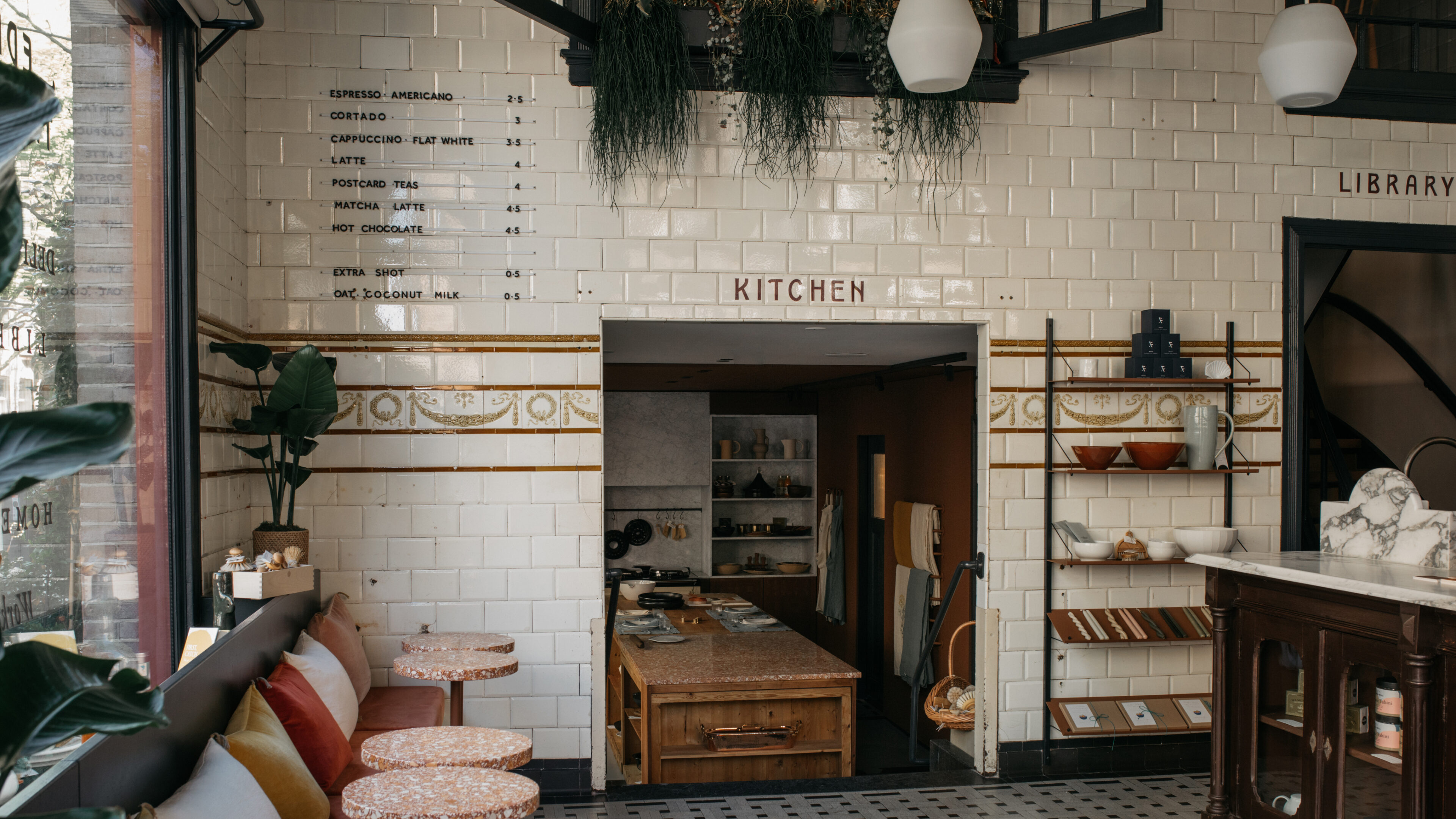
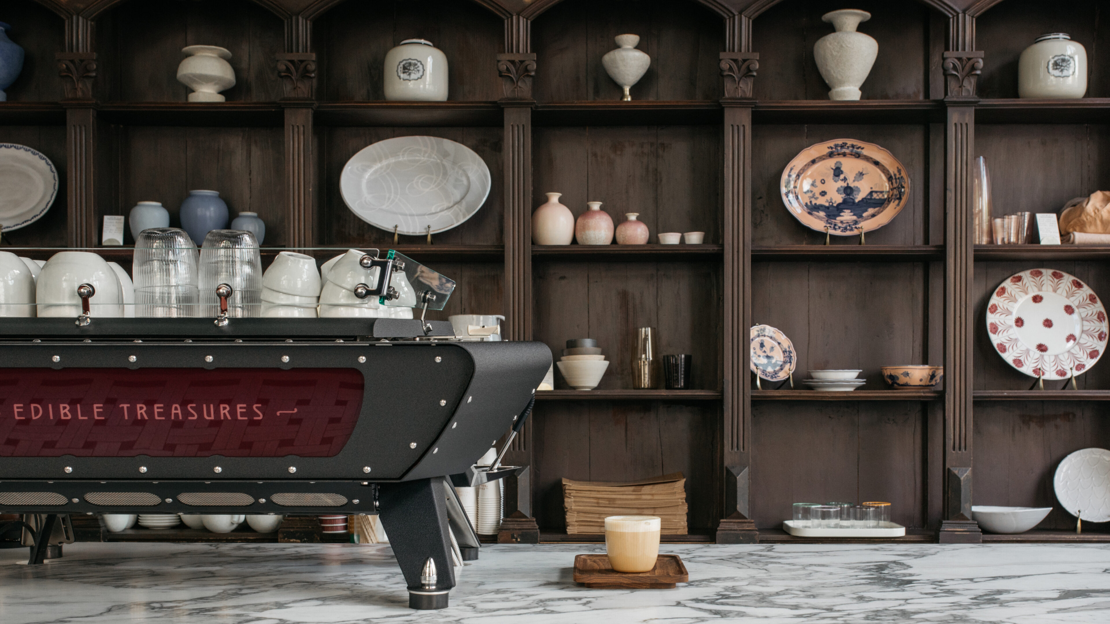
On the corner of Jacob Obrechtstraat in West Amsterdam is a building with a rich and varied history. Amsterdam’s past, and its future, in one grand corner shop. Over the building’s lifetime it has been many things, today it is a tribute to all of them.
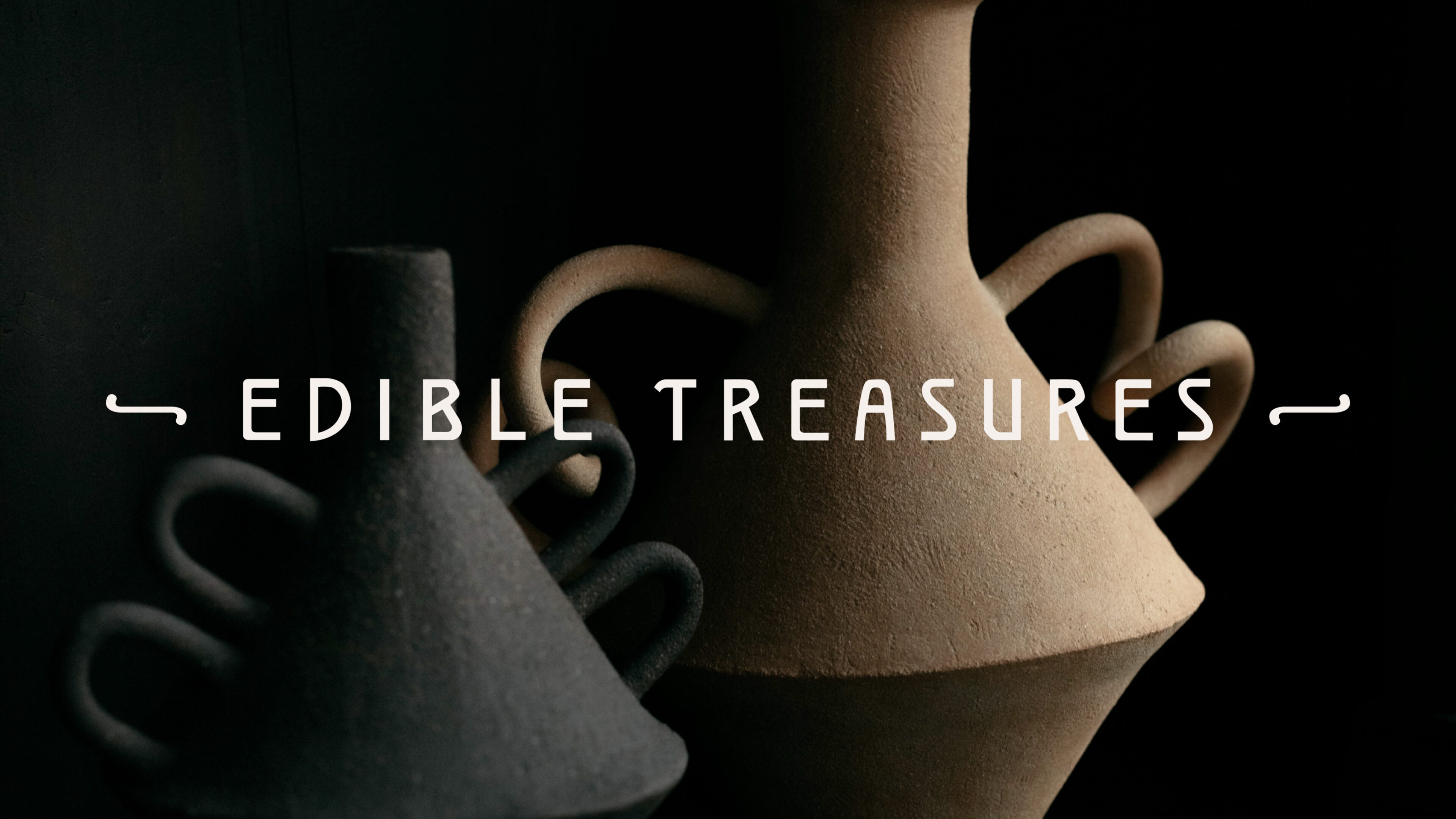
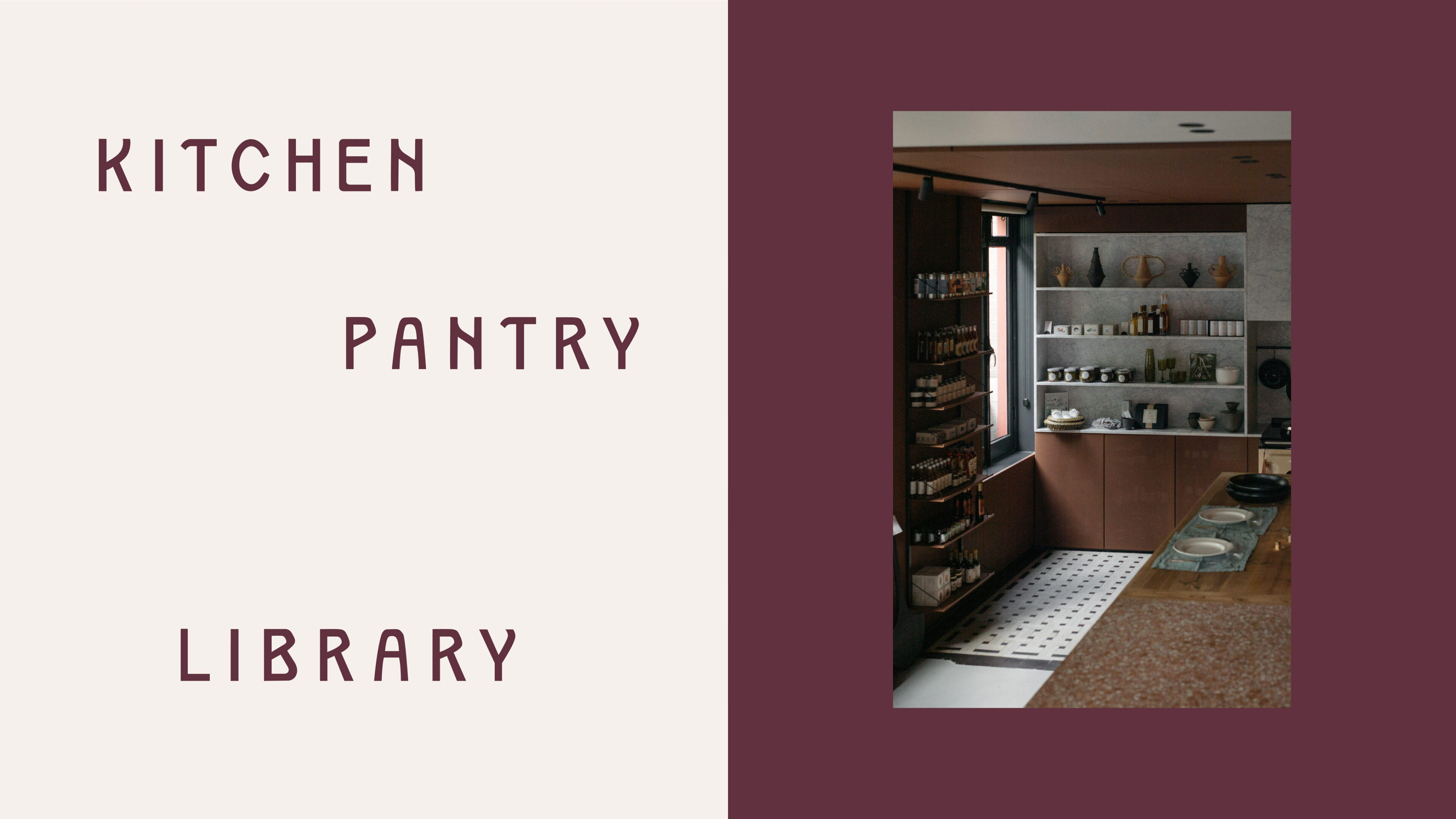
Edible Treasures, as it is now called, is host to: a deli, a kitchen, workshop spaces, a pantry - for provisions, a library and bookshop, and a cooking and homeware store. The whole space is a timeless yet contemporary celebration of food, of eating, of cooking, of togetherness.
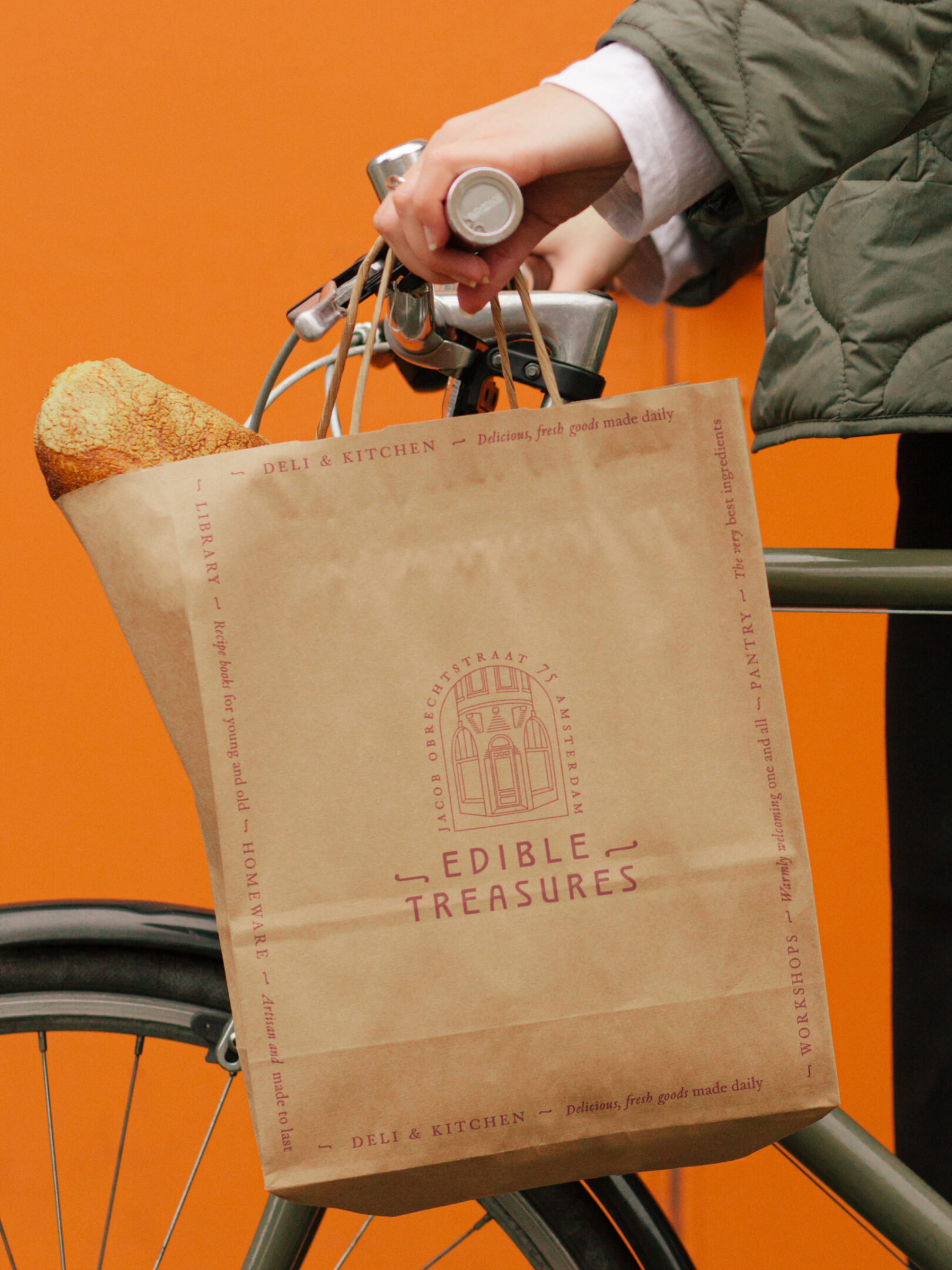

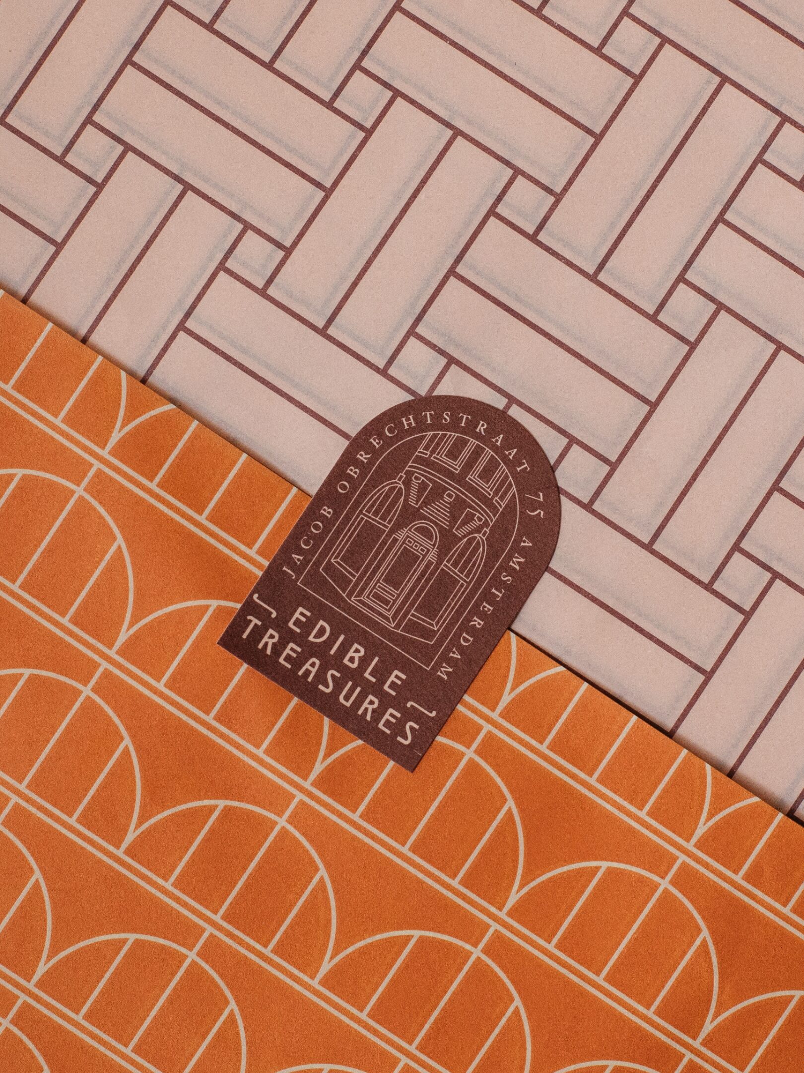
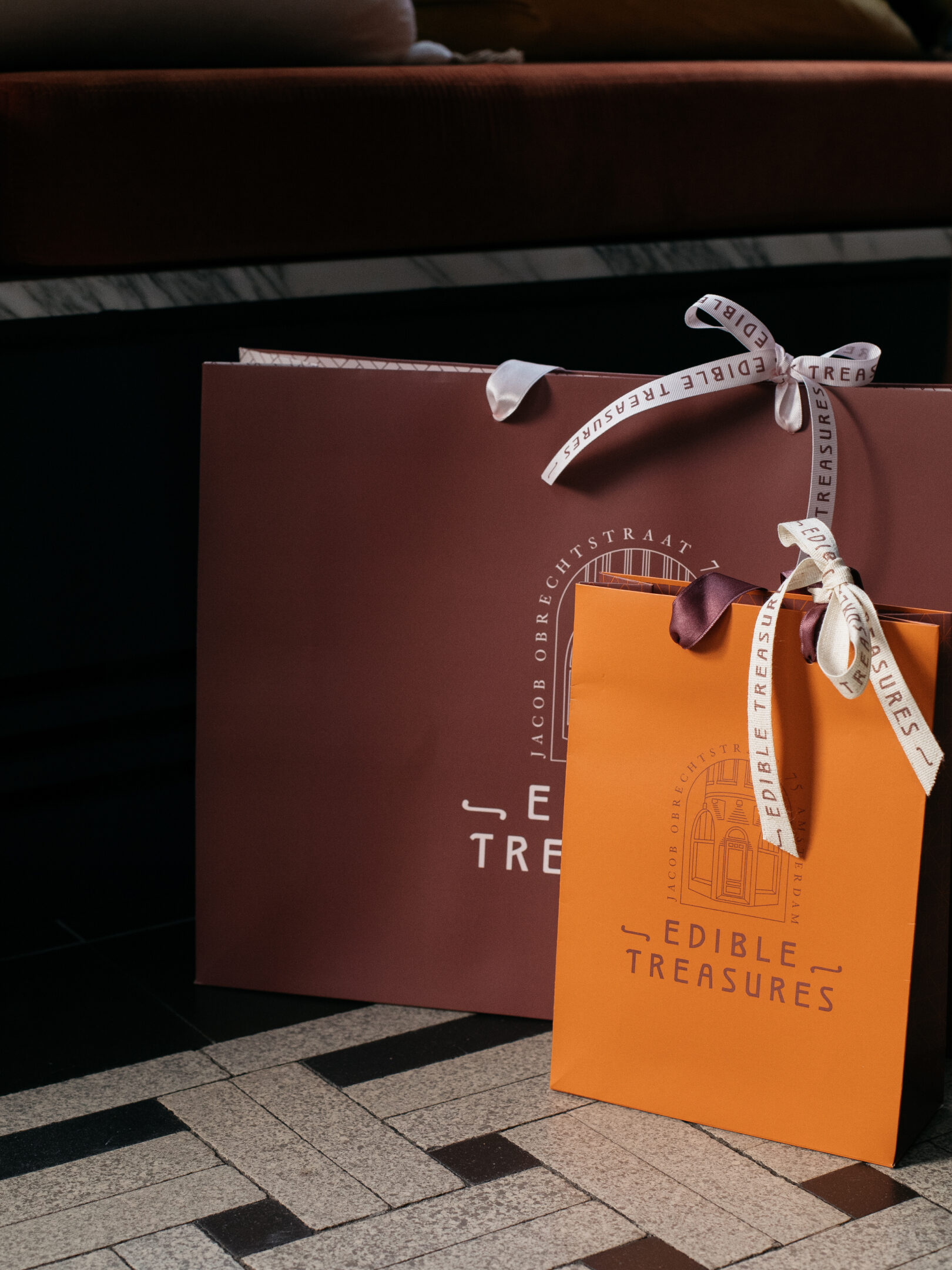
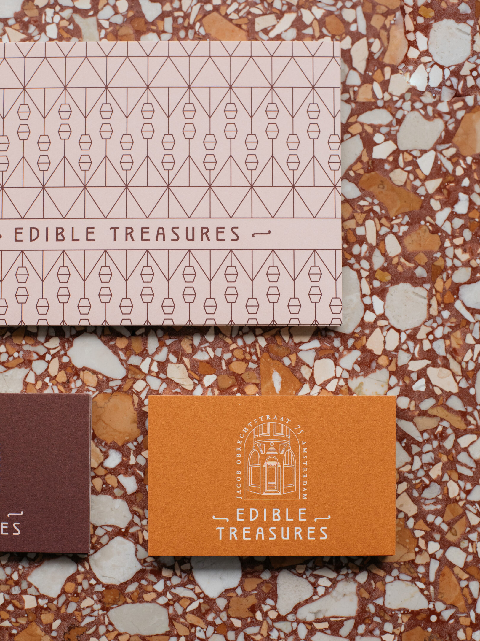
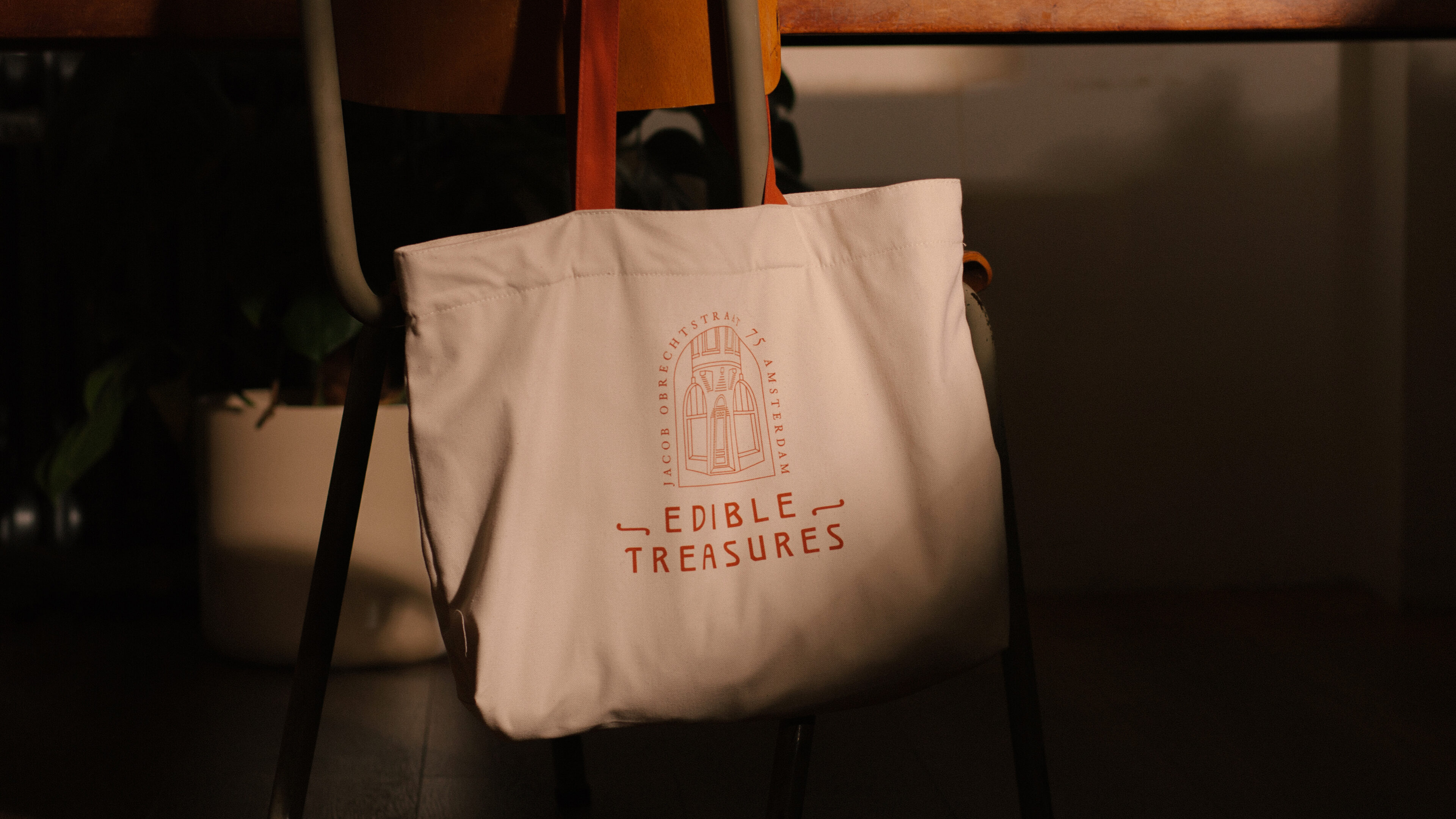
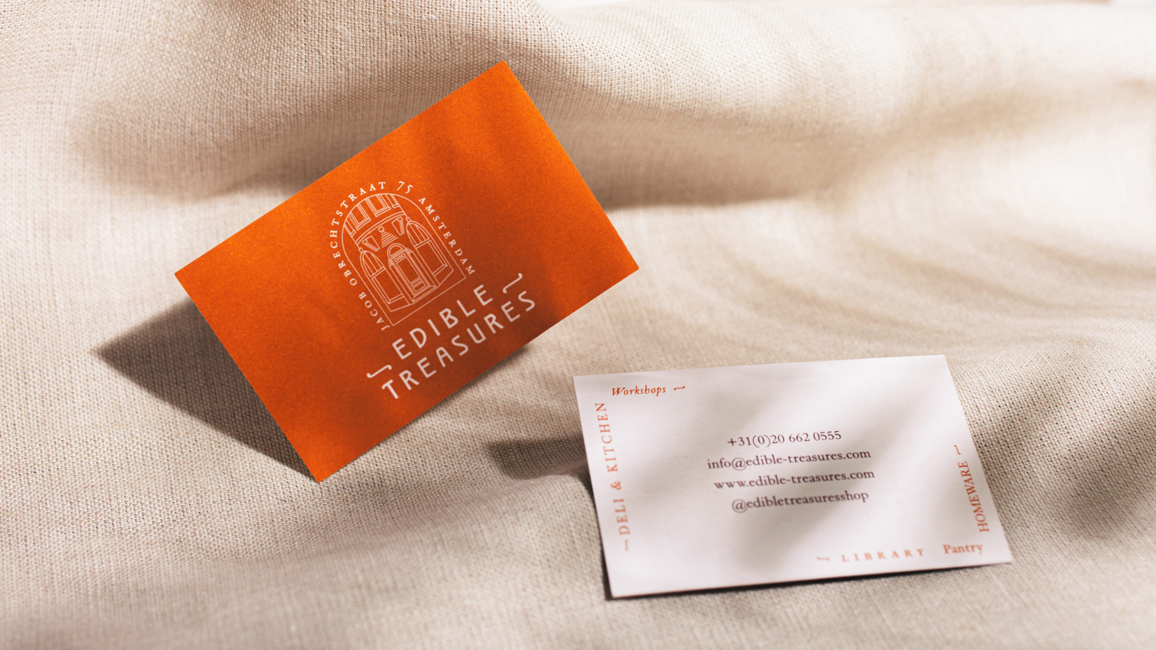
Edible Treasures’ icon is held within an arch, inspired by the arched door and grand windows of the building. It’s a contemporary representation of a building that’s hundreds of years old, and makes it feel like an invitation - a welcoming new destination for the neighbourhood.
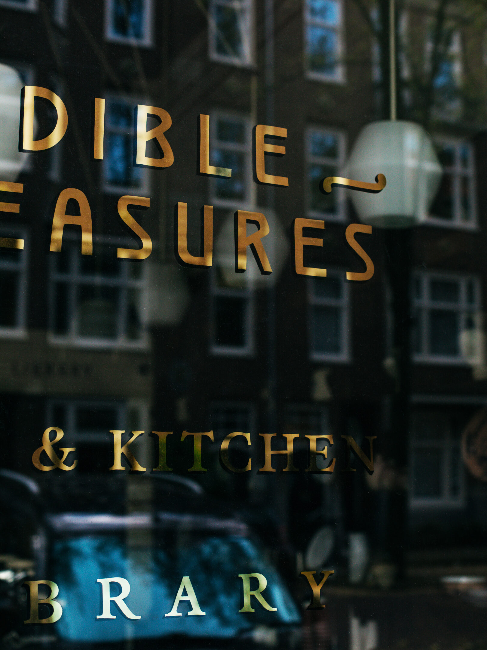
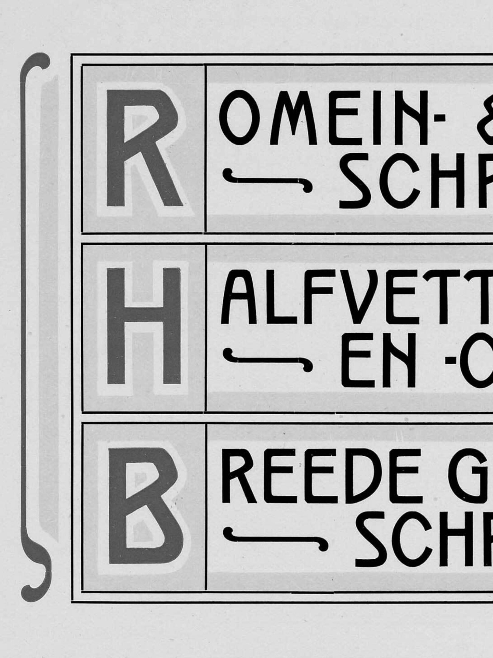
The Edible Treasures’ logotype is inspired by the quirks of traditional Dutch typography. We created a custom typeface and flared ornaments to bring character to all of the applications.
“From the start of the project we knew we had to hero the incredible original features of the building and bring them to life in a modern way. It was a great chance to delve into Dutch type archives and discover the nuances of traditional Dutch typefaces.”
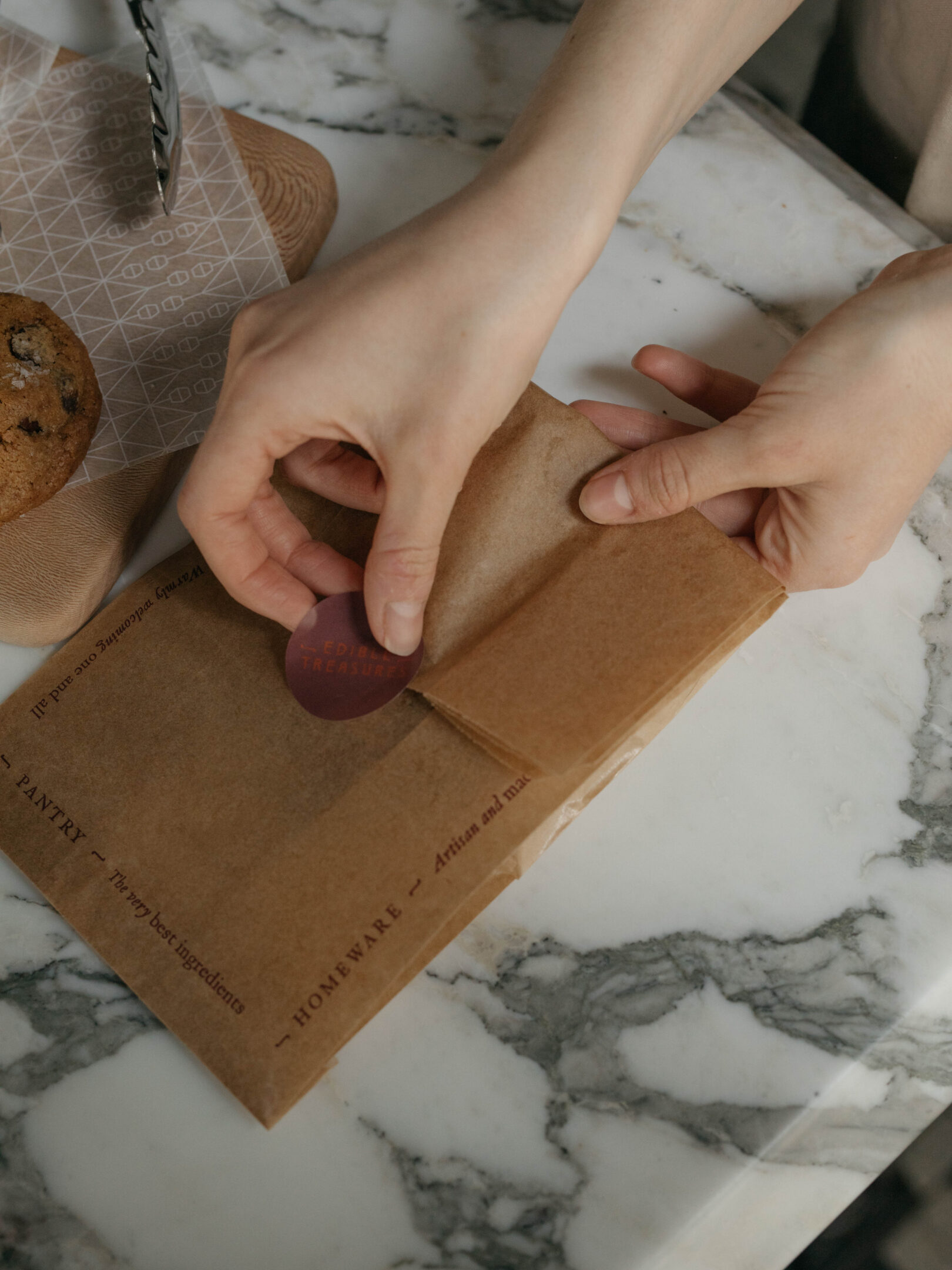
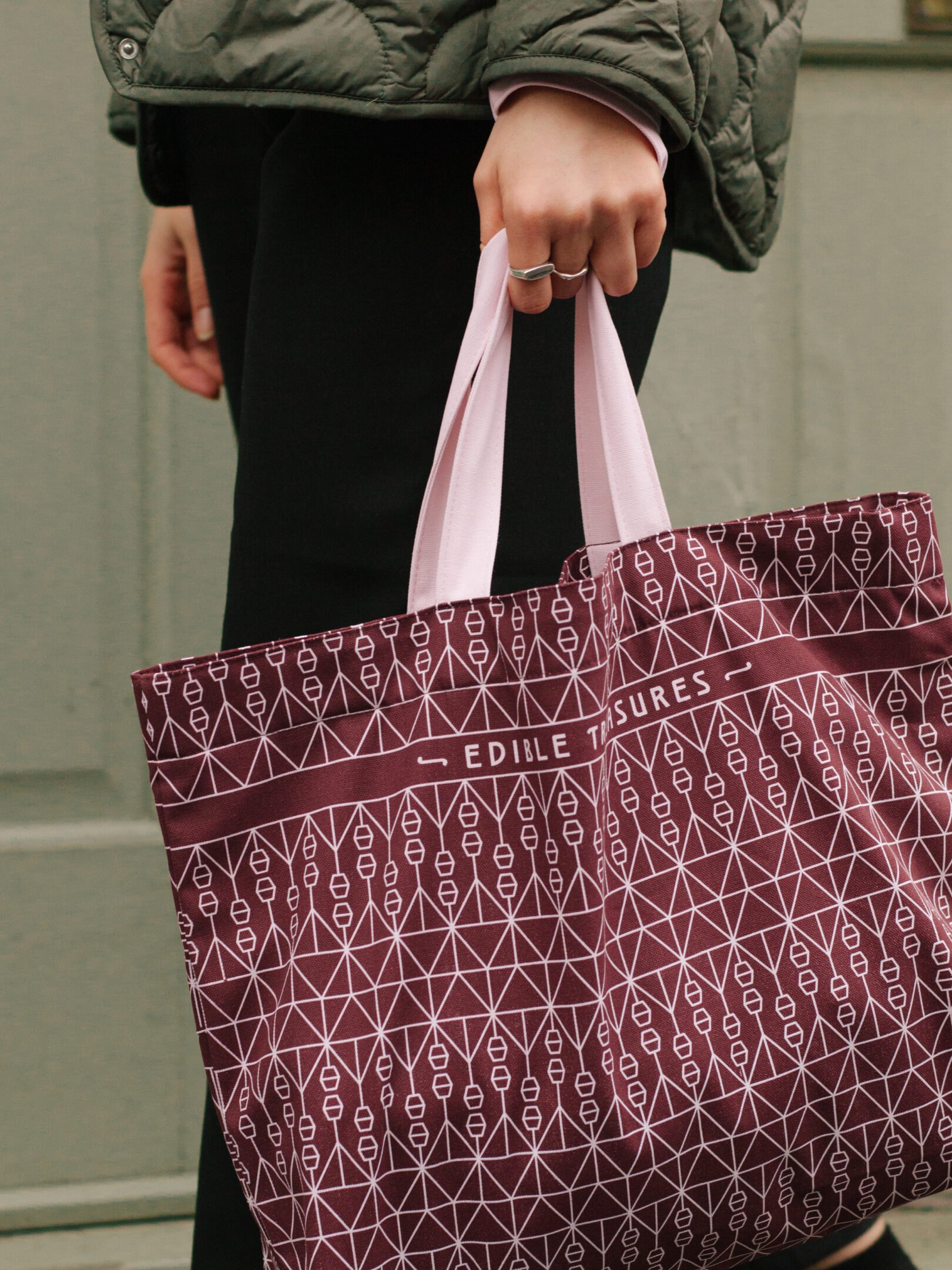
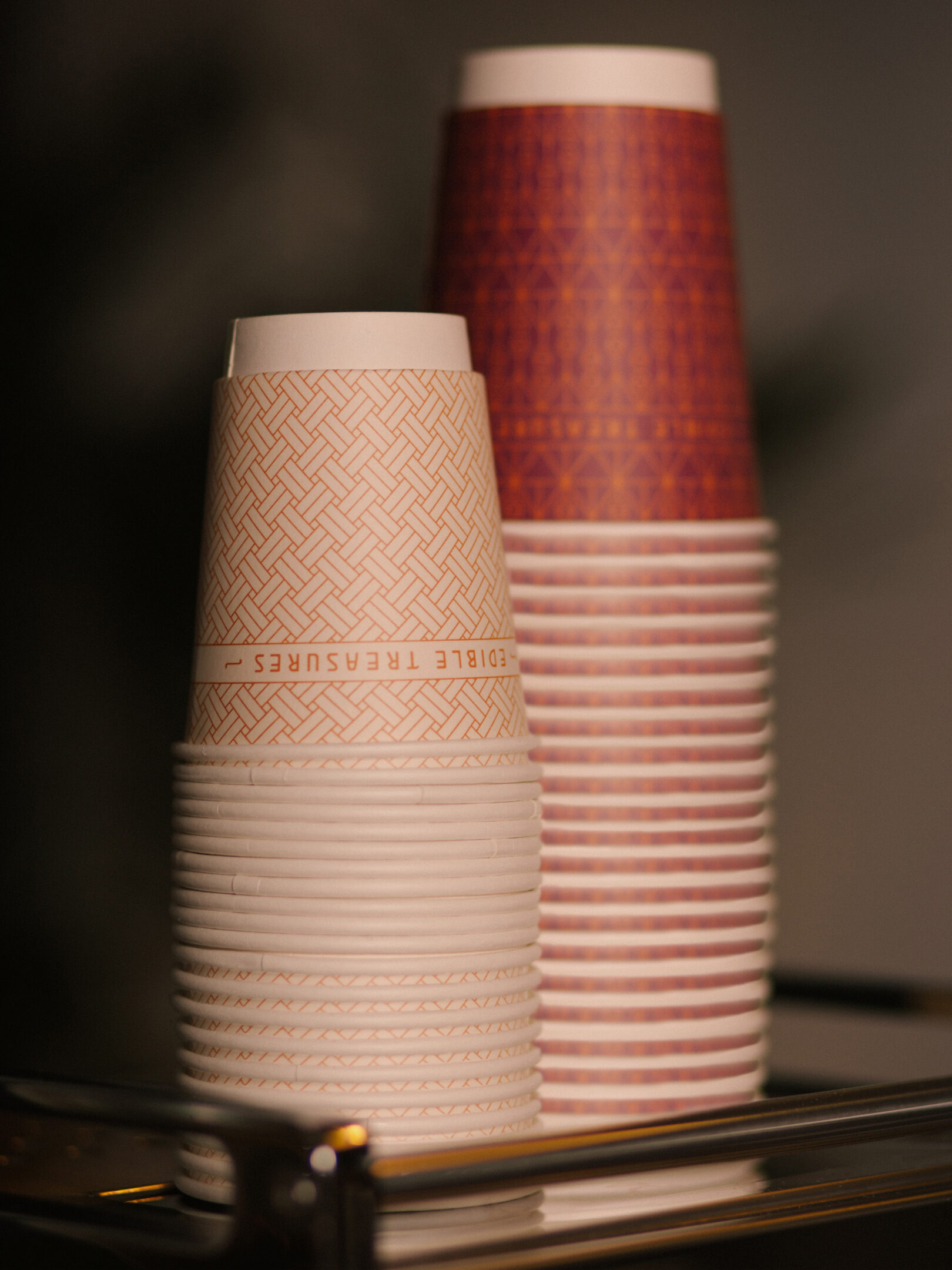
The architecture of 75 Jacob Obrechtstraat is unique, with defining features that inspired us and from which we were able to create new patterns. The original light fitting with its striking geometric framework was the inspiration for the linear style.
CLIENT
Edible Treasures SECTOR Food and beverage
COLLABORATORS
Photography — Nomades Photography — Edible Treasures |
RELATED WORK
The Fife Arms— Art meets hospitality
Two Drifters— A journey that takes you away, a truth that brings you home |