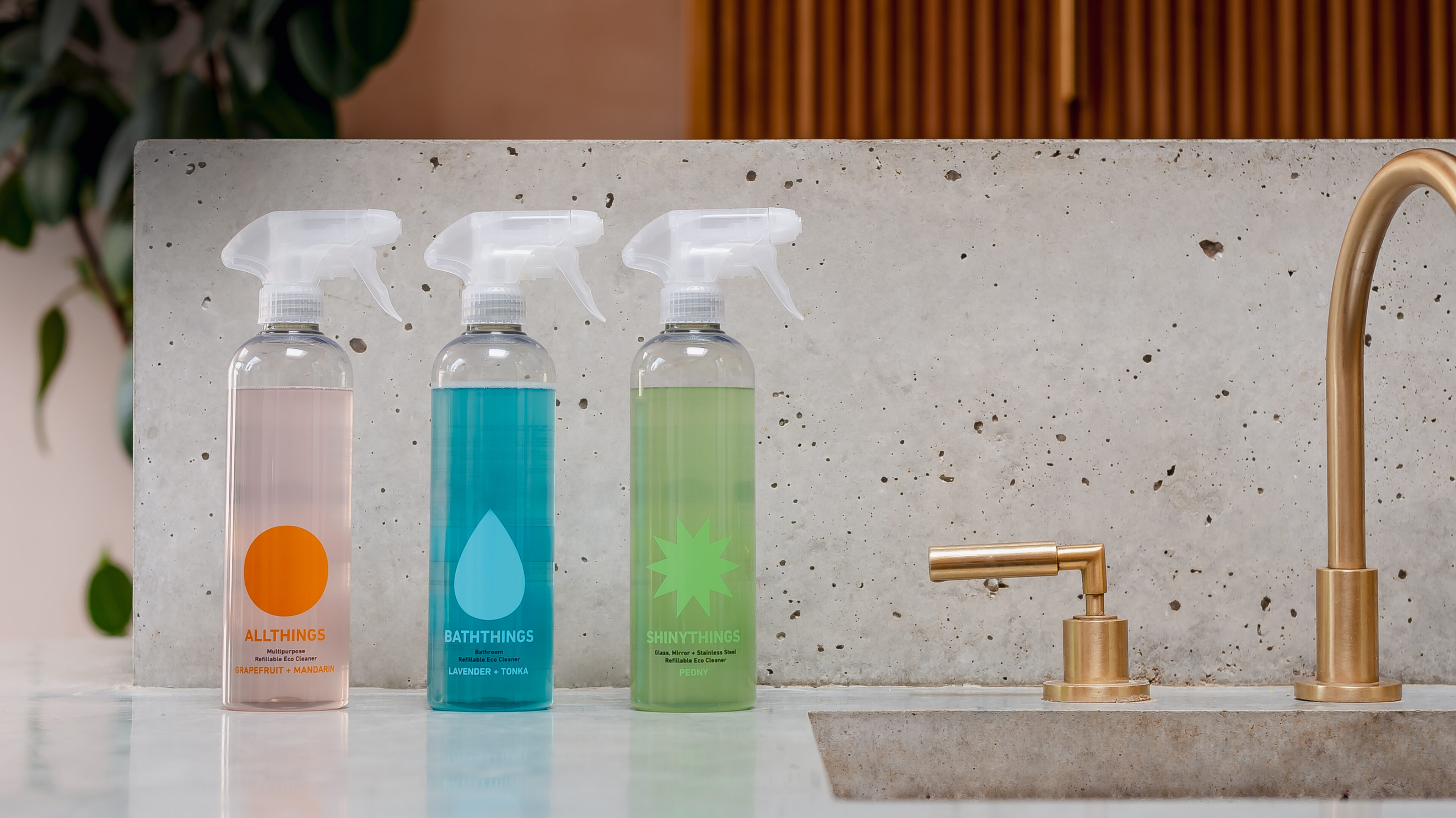
The world of cleaning is cluttered. Homethings gives it a freshen up. Tim Keaveney and Matt Aubrey are challenging the global homecare industry to clean up its act with their revolutionary refillable products. They came to us looking for a visual identity and packaging that packs a cleansing punch: loud and proud with an axe to grind.
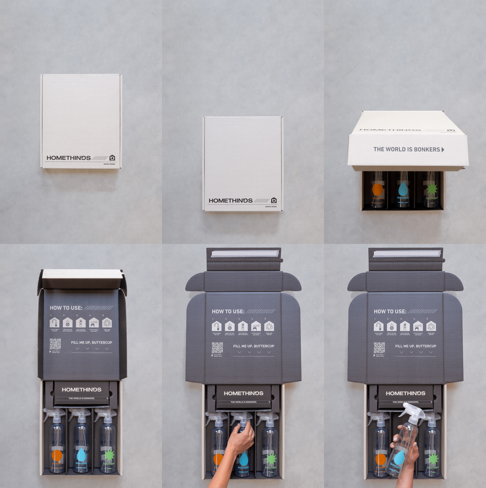
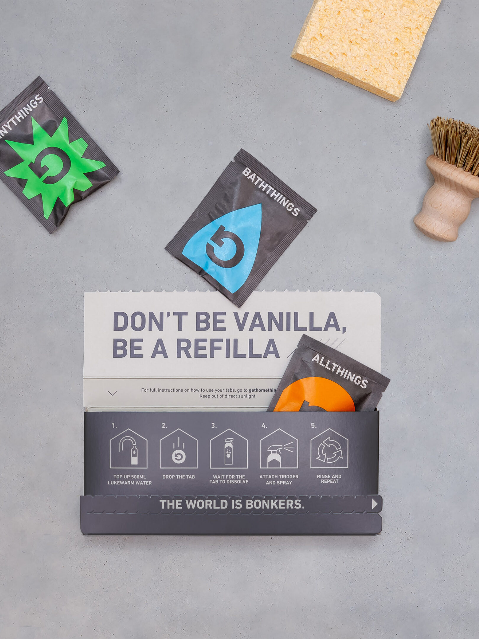
In balancing function and fun, we had to think about communicating efficacy in a more playful way. We started by creating a grounded, functional brand world inspired by the simplicity of IKEA, using a primary palette of charcoal and beige, with mix of heavy graphic elements and lighter lines.
We then echoed this across the brand iconography, a shorthand for cleaning instructions.
The new icon set feels playful and ownable, while remaining easy to understand. The shape was also used in the bottle design, introducing a distinctive ‘house’ shape into the neck, transforming a bog-standard bottle into a distinctive brand asset.
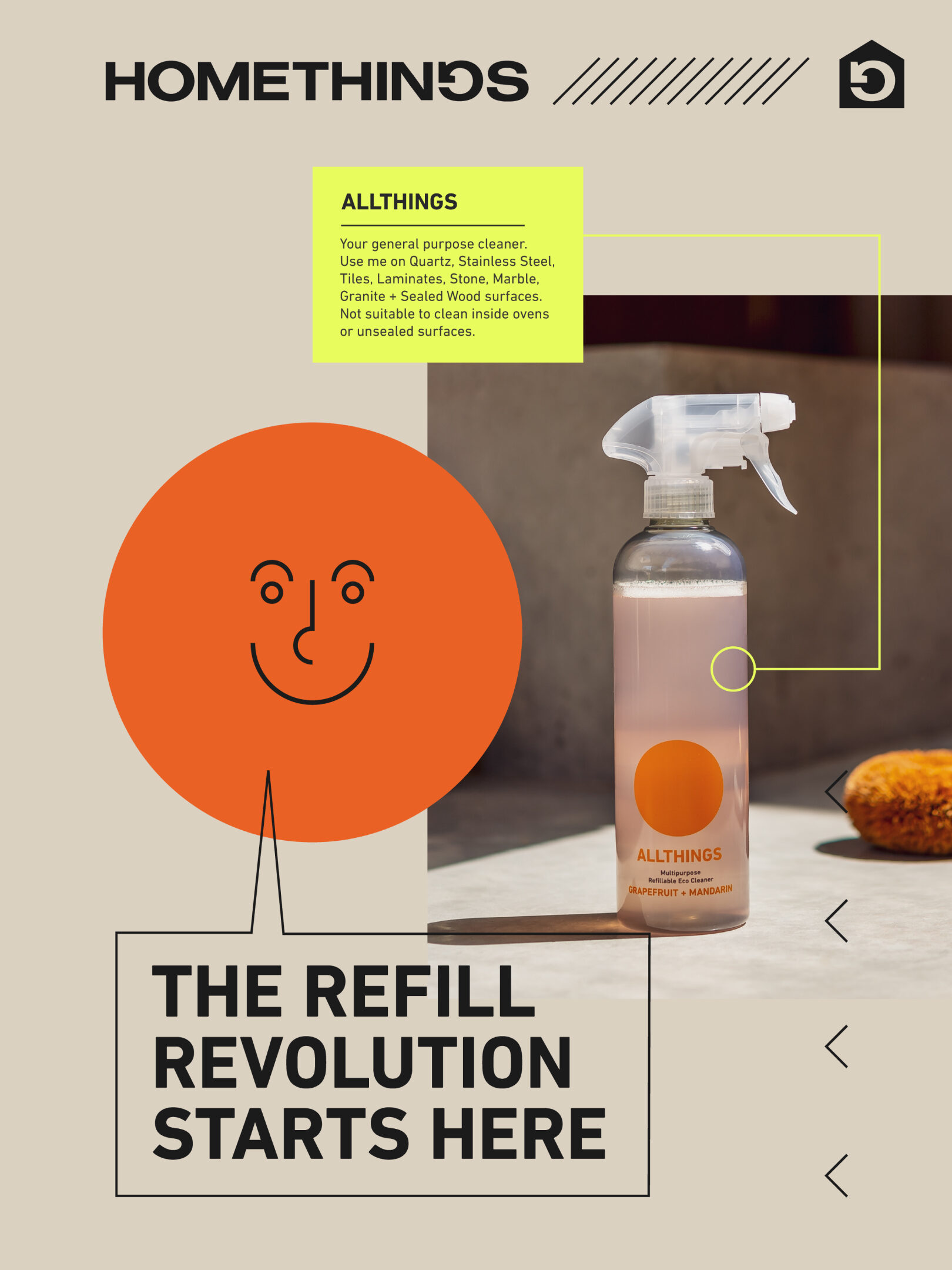
We all know the world is messed up. Homethings isn’t afraid to say it, and actually do something about it.
RELATED WORK
The Balvenie Sixty— A Lifetime of Memories
Edible Treasures— In old and new Amsterdam |