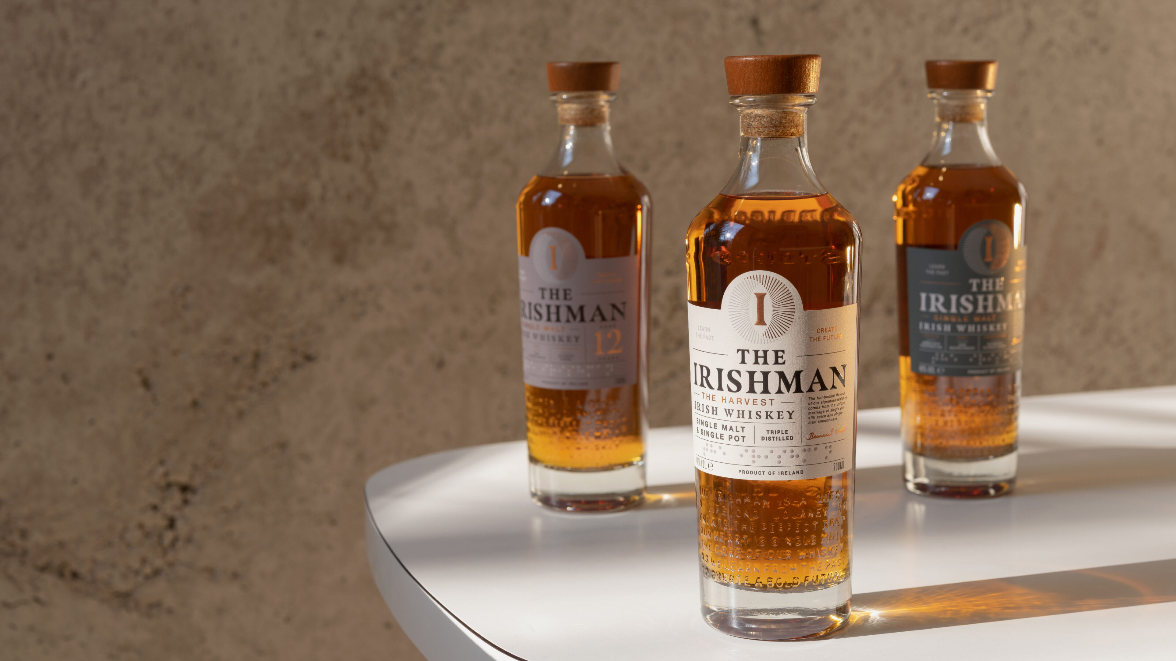
With an incredible range of whiskies, but a brand that was often overlooked, The Irishman needed help to “speak from the heart” and showcase the true character of the single malt expressions created by this family-run distillery. In the formal and formulaic world of single malts, this work for The Irishman tells stories that are sensorial, not mechanical.
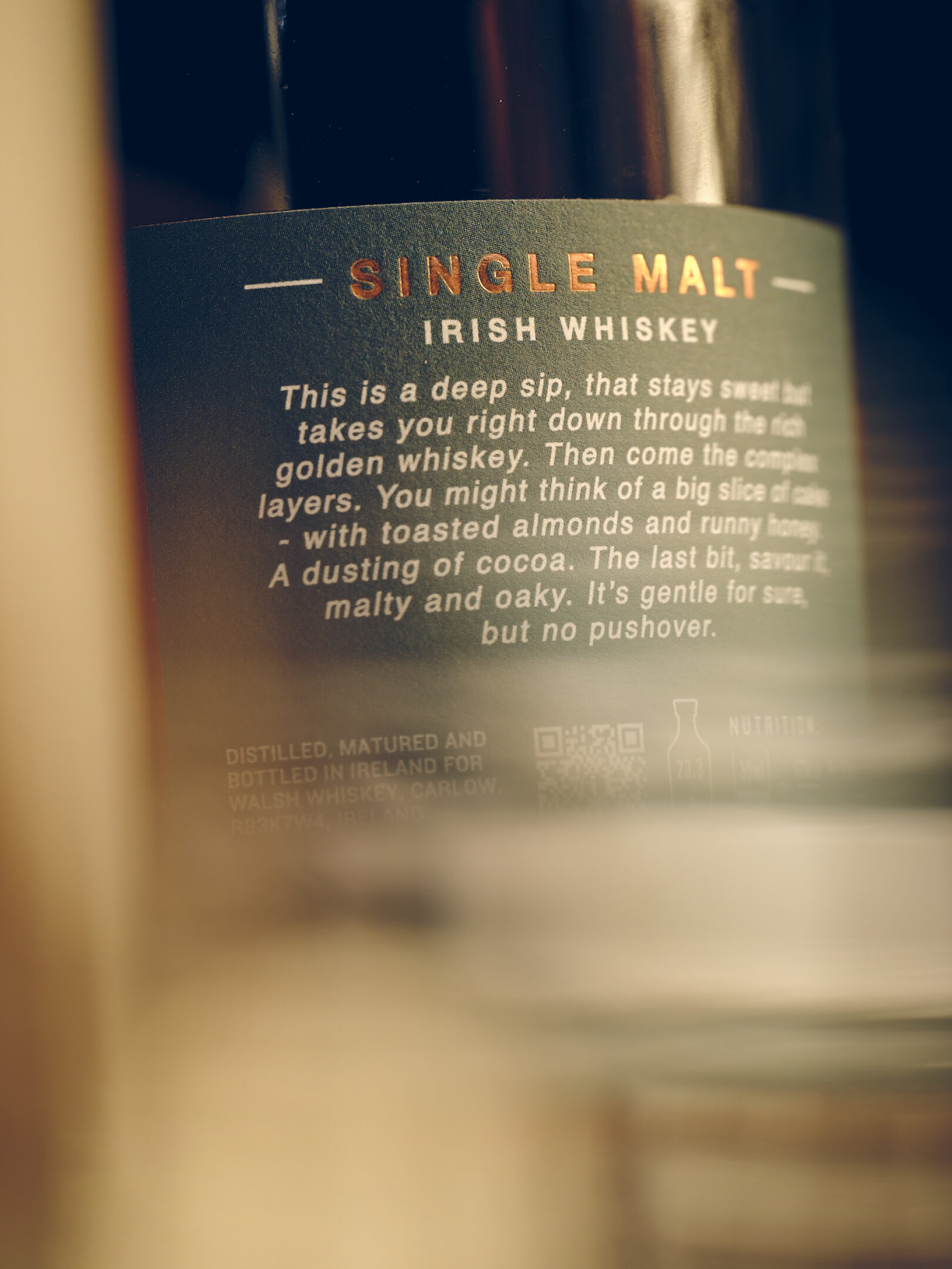
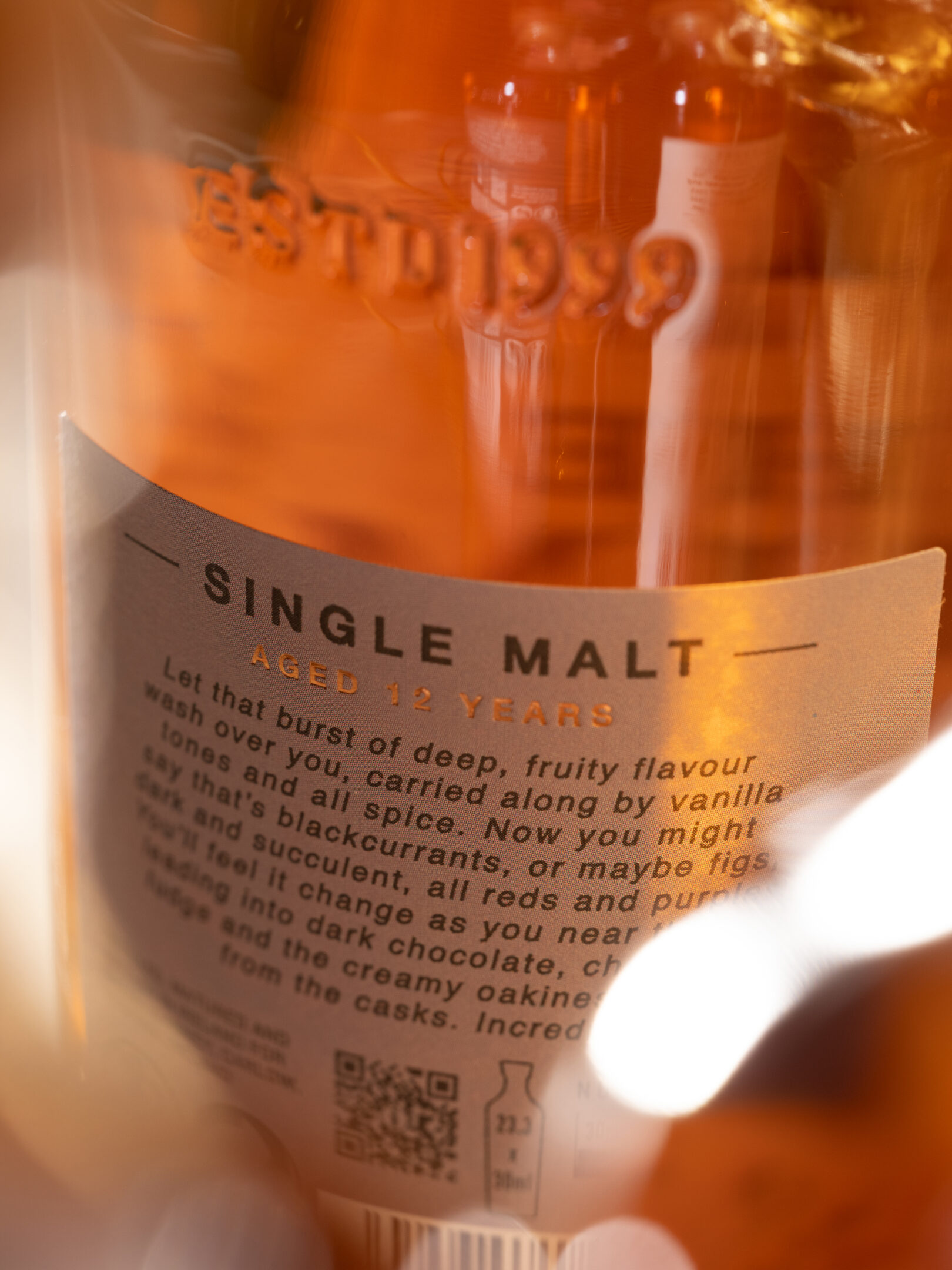
The brand voice evokes the camaraderie and the taste appeal of a real, live whiskey tasting: an experience that welcomes people, demystifies whiskey and gets their imaginations going. A voice that, just as all good whiskies should, leaves a lasting impression.

This voice is conversational, not prescriptive. Sensorial, not stilted. And narrates stories that invite people in, making them feel excited to try every expression of The Irishman.
THE ICON
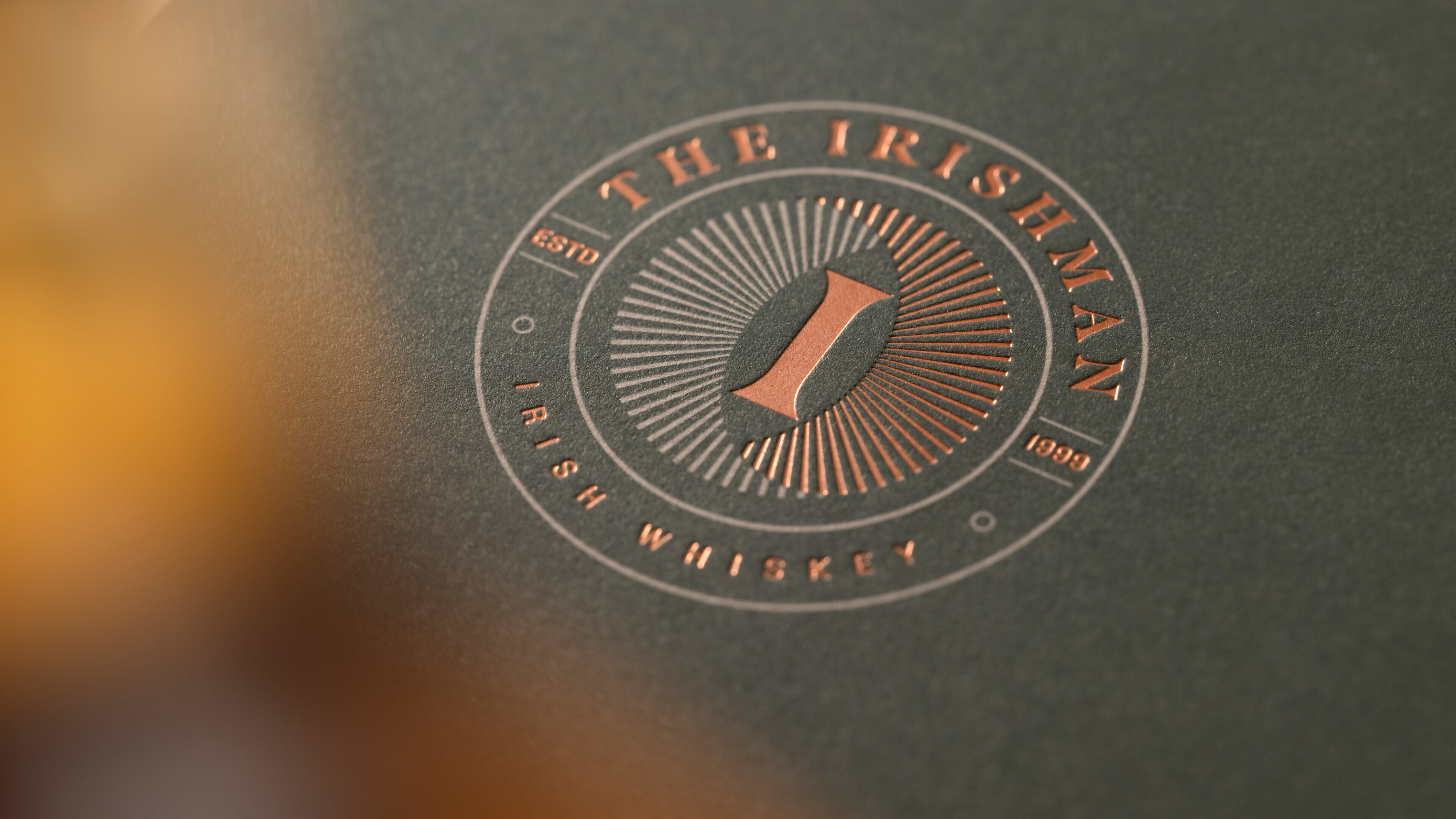
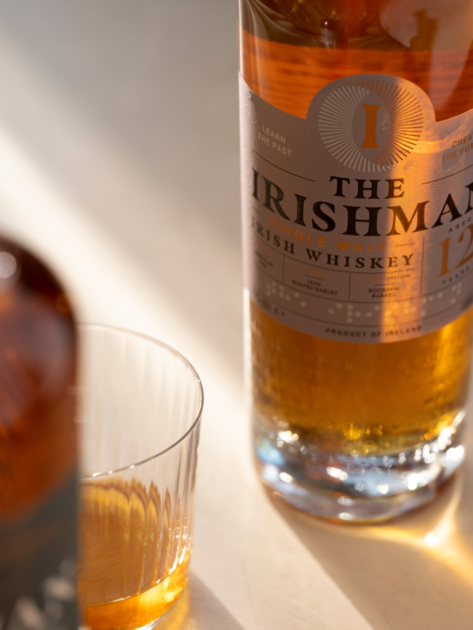
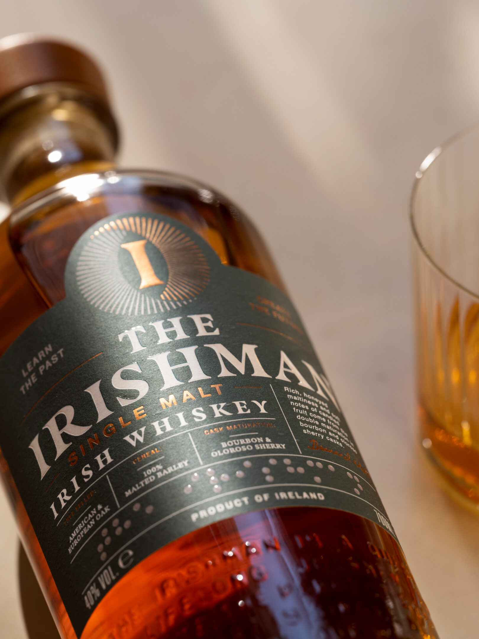
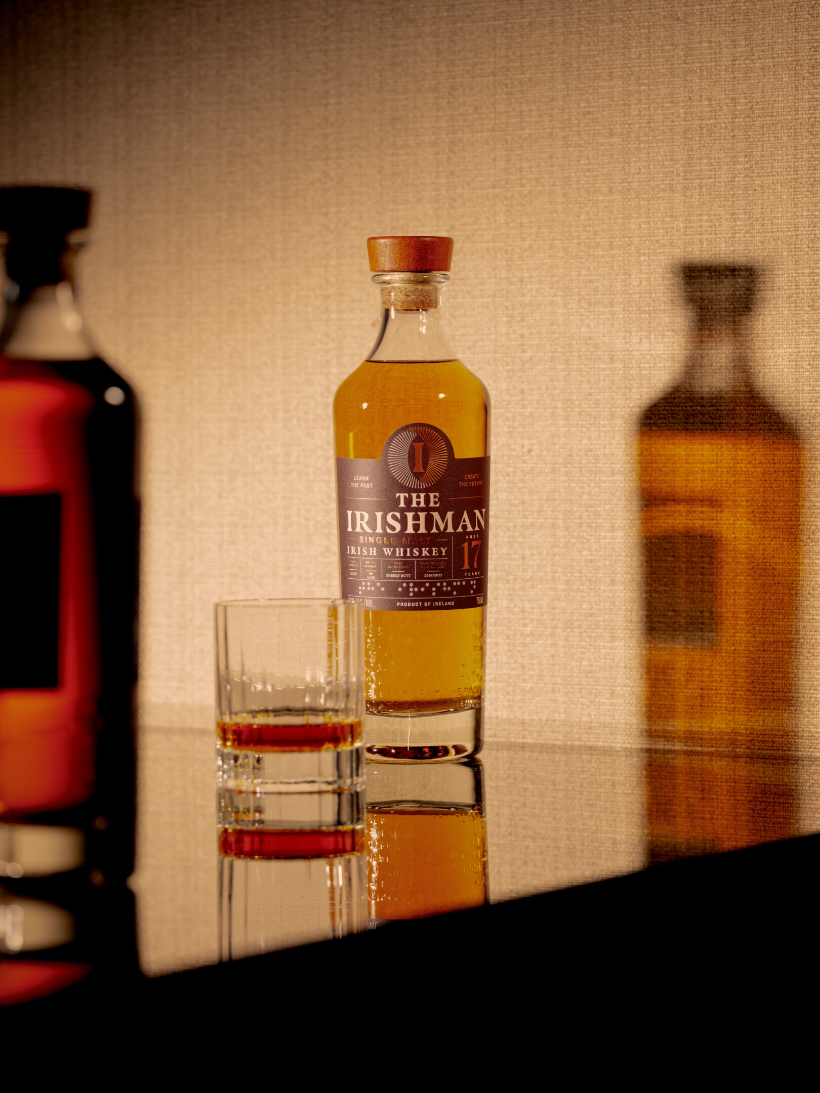
Eye-catching as well as ear-catching, The Irishman’s visual world includes a new icon that evokes not only the confidence and charisma of speaking from the heart, but also the embodiment of the brand’s ethos: learn the past, create the future.
The continuous lines represent barrel staves, and surround the ‘I’ for The Irishman in the middle. The icon represents both the tried and tested distillation methods and the knowledge that honours Ireland’s great distilling heritage, alongside The Irishman’s continued desire to innovate and create better and bolder expressions.
COLOUR
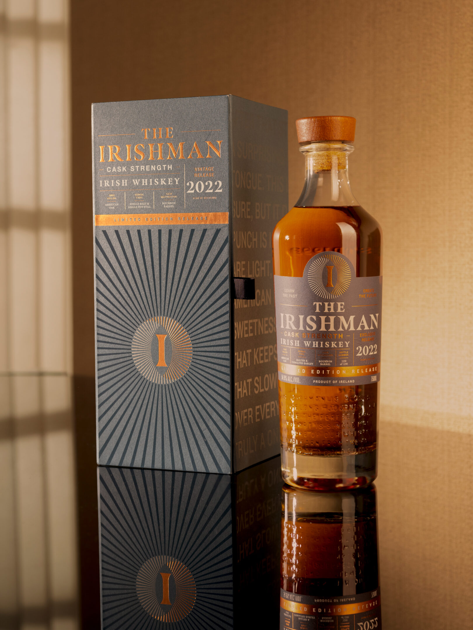
True to the desire to help the brand to speak up and speak from the heart, the new colour palette is sleek and modern. Uplifting every individual whiskey variant, and becoming richer and deeper as drinkers progress through the range to the more exclusive releases.
THE NEW BOTTLE
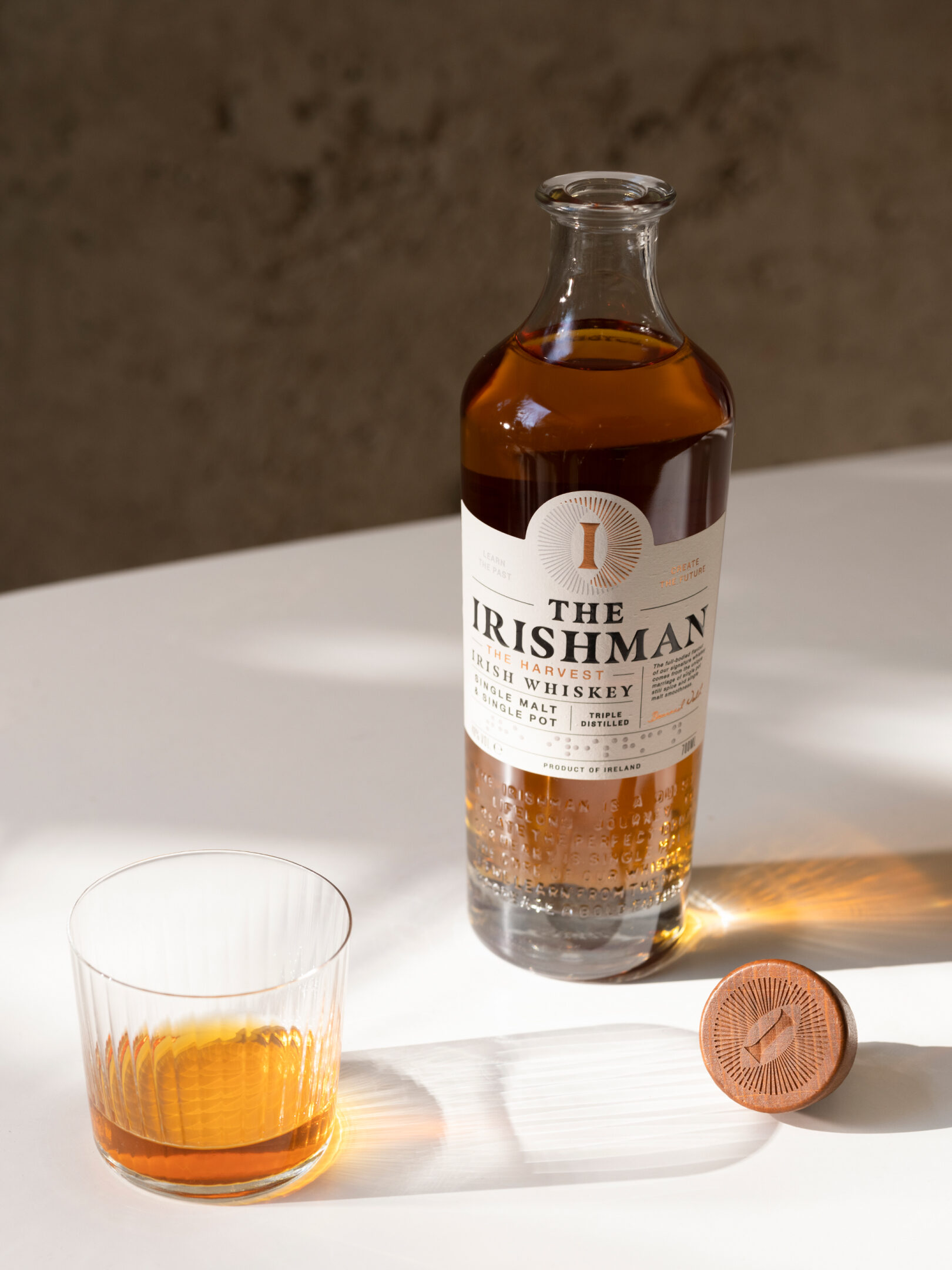
The bottle's new shape balances elegance with authority: the perfect encapsulation of The Irishman’s substance and style. It presents a strong profile on shelves and behind bars, and also allows for the core brand story to be embossed around the glass on the bottom half of the bottle. This typographic detail allows the brand to continue to speak from the heart, at every touchpoint.
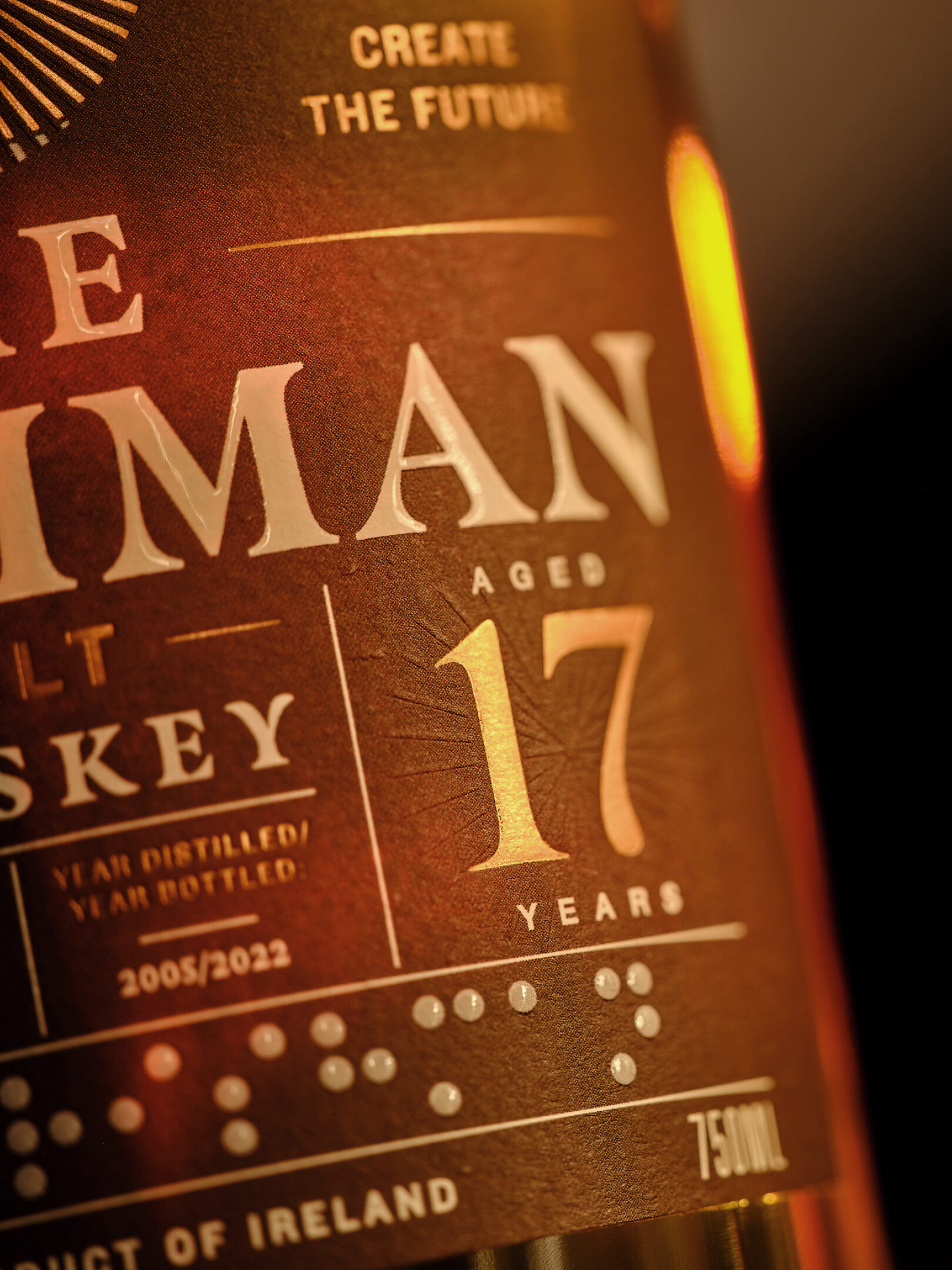

THE SMALLER DETAILS
One other notable touch is the braille used on the label, a personal tribute by the founder Bernard Walsh to the memory of his grandfather Jack whose loss of vision made a lasting impression with his grandson.

CLIENT
Walsh Whiskey SECTOR Beverages |
RELATED WORK
The Balvenie— The Art of Cask Finishing
Ardray- A Whisky of Exquisite Balance |