Way of Life made it their mission to make renting not only easy but enjoyable. By combining thoughtfully designed and ready-to-move-in accommodation with no-fuss tenancy management and a 24/7 in-house team, they raised the bar and set the new rental standard. This concept of beautiful spaces that promote progressive models of living aligns with our own philosophy of Beautility. So working on their identity felt like a match made in heaven.
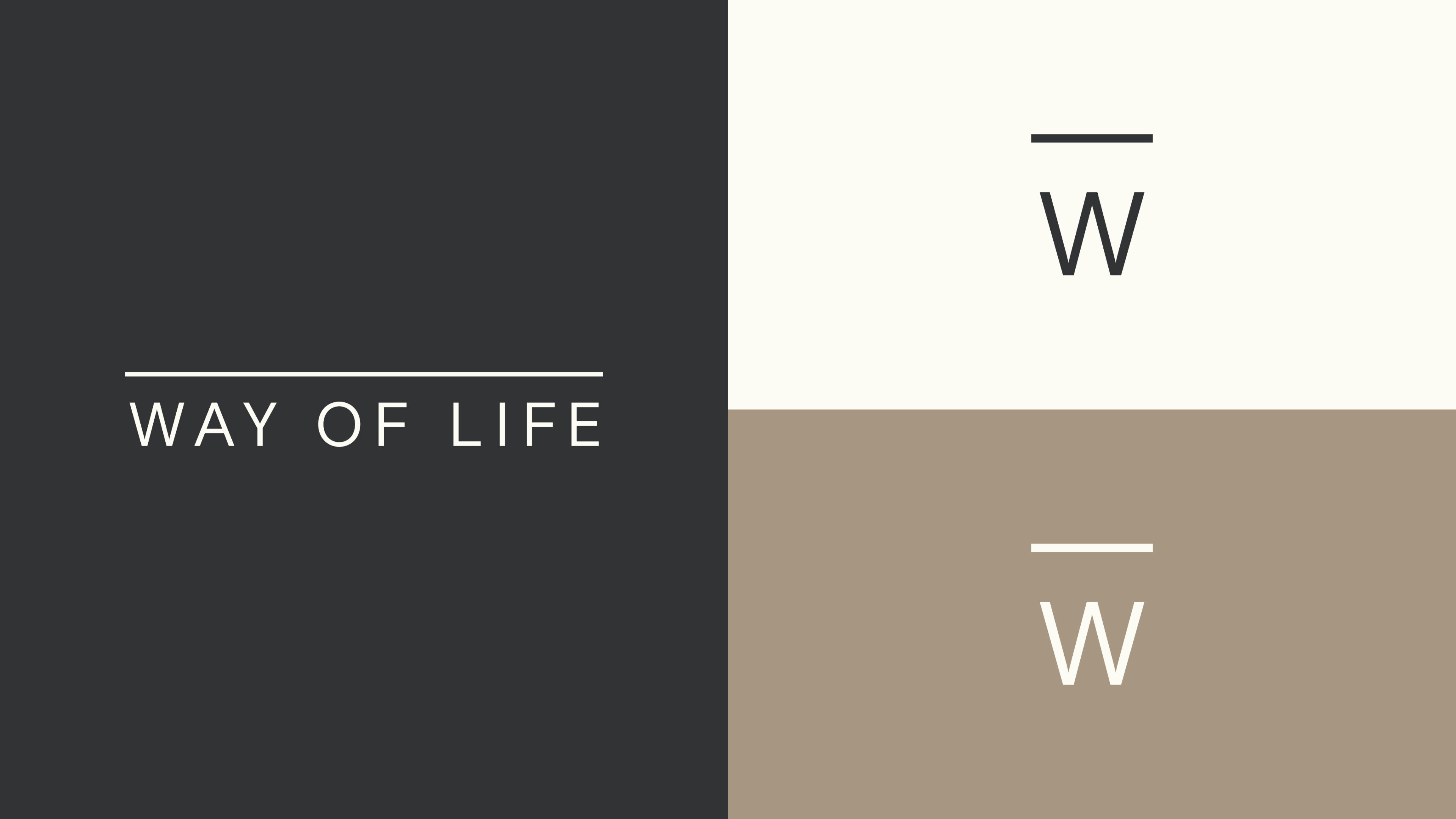
The Way of Life masterbrand identity acts as a neutral canvas – or foundation – creating empty space for the personality of each building (and its residents) to be expressed. We drew inspiration from the identities of art galleries, which use restraint to allow their exhibitions to shine.
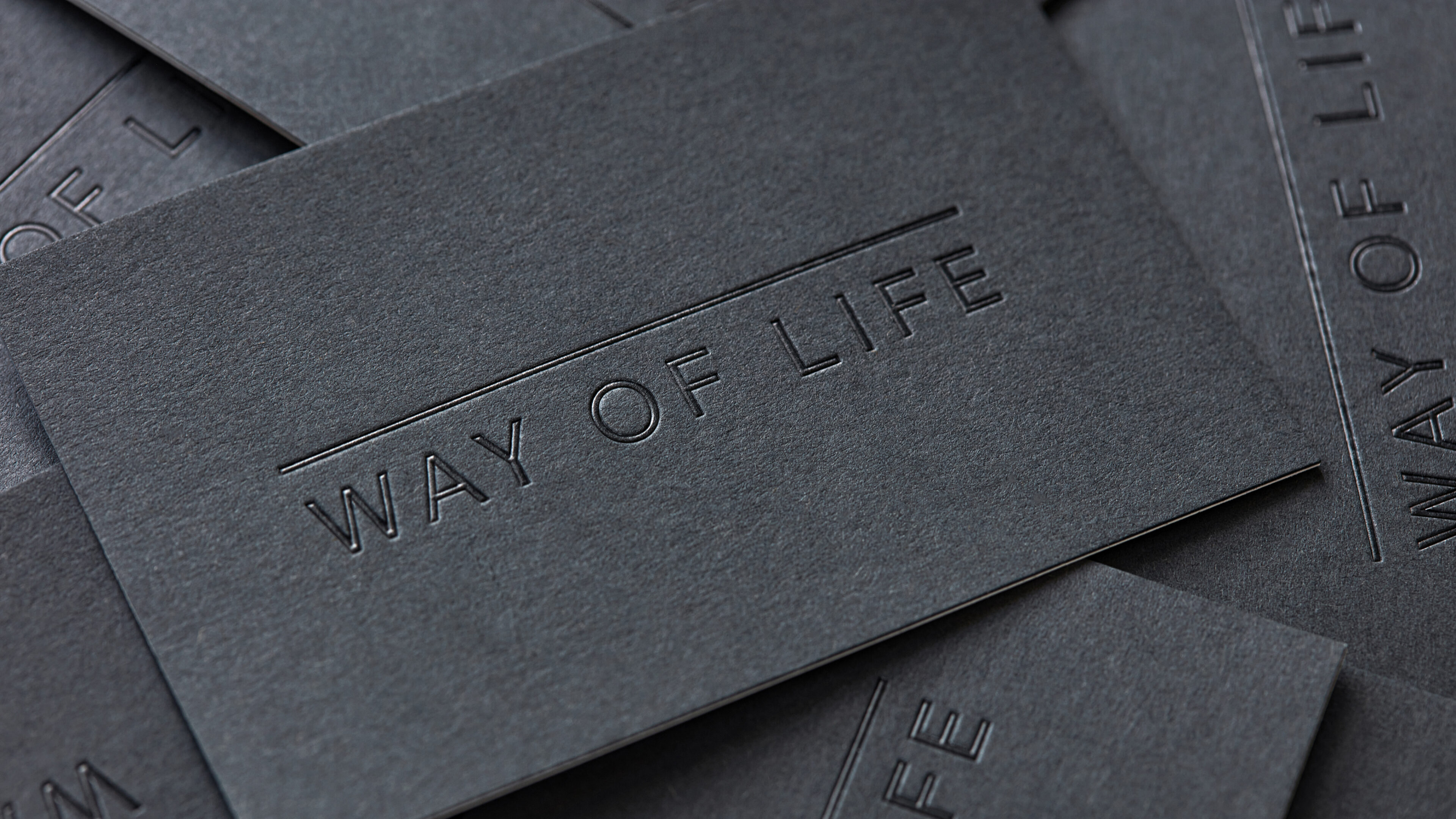
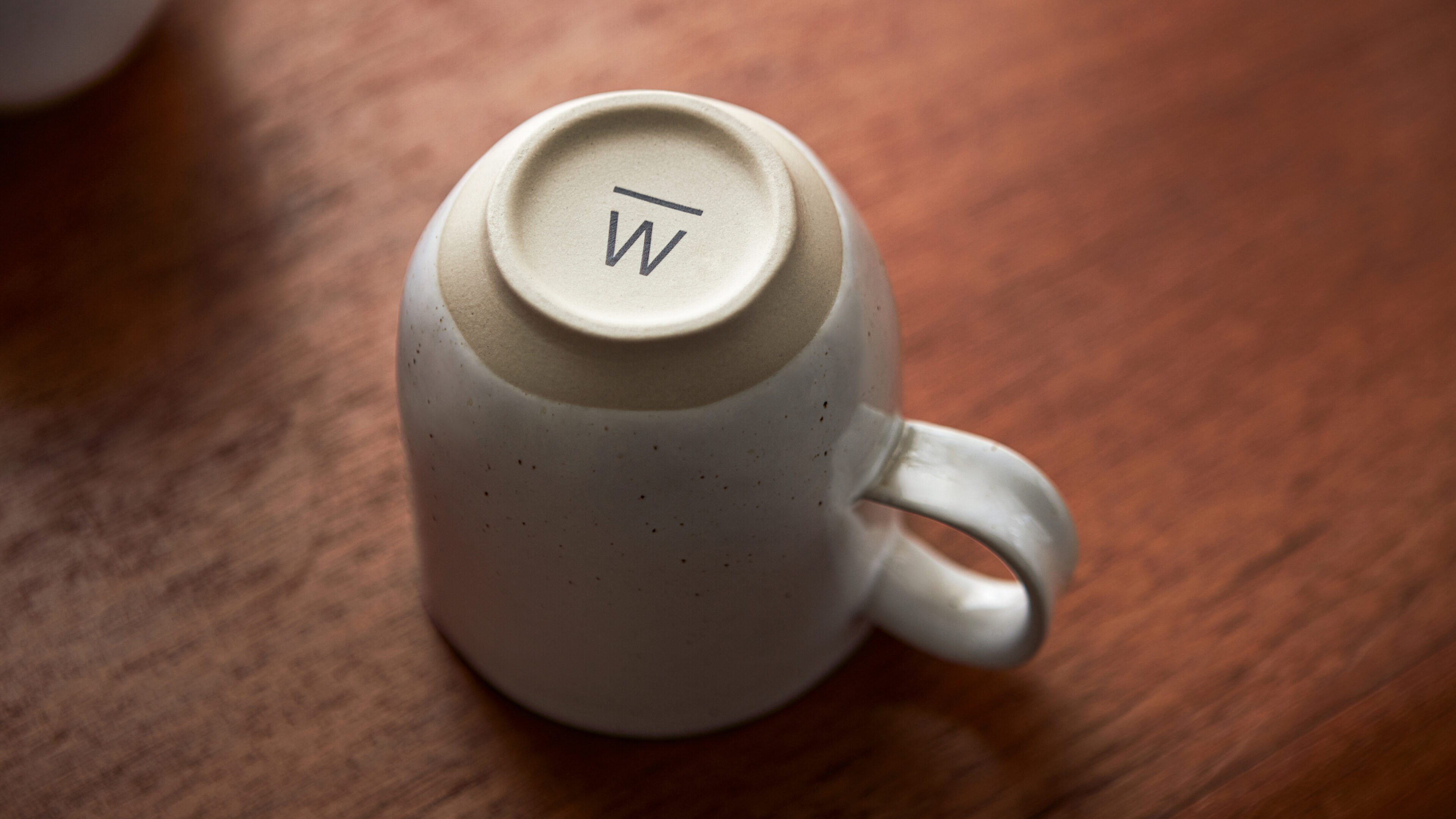
The line that sits above the wordmark and ‘W’ shorthand represents an underlying foundation, implying that the brand supports its community.
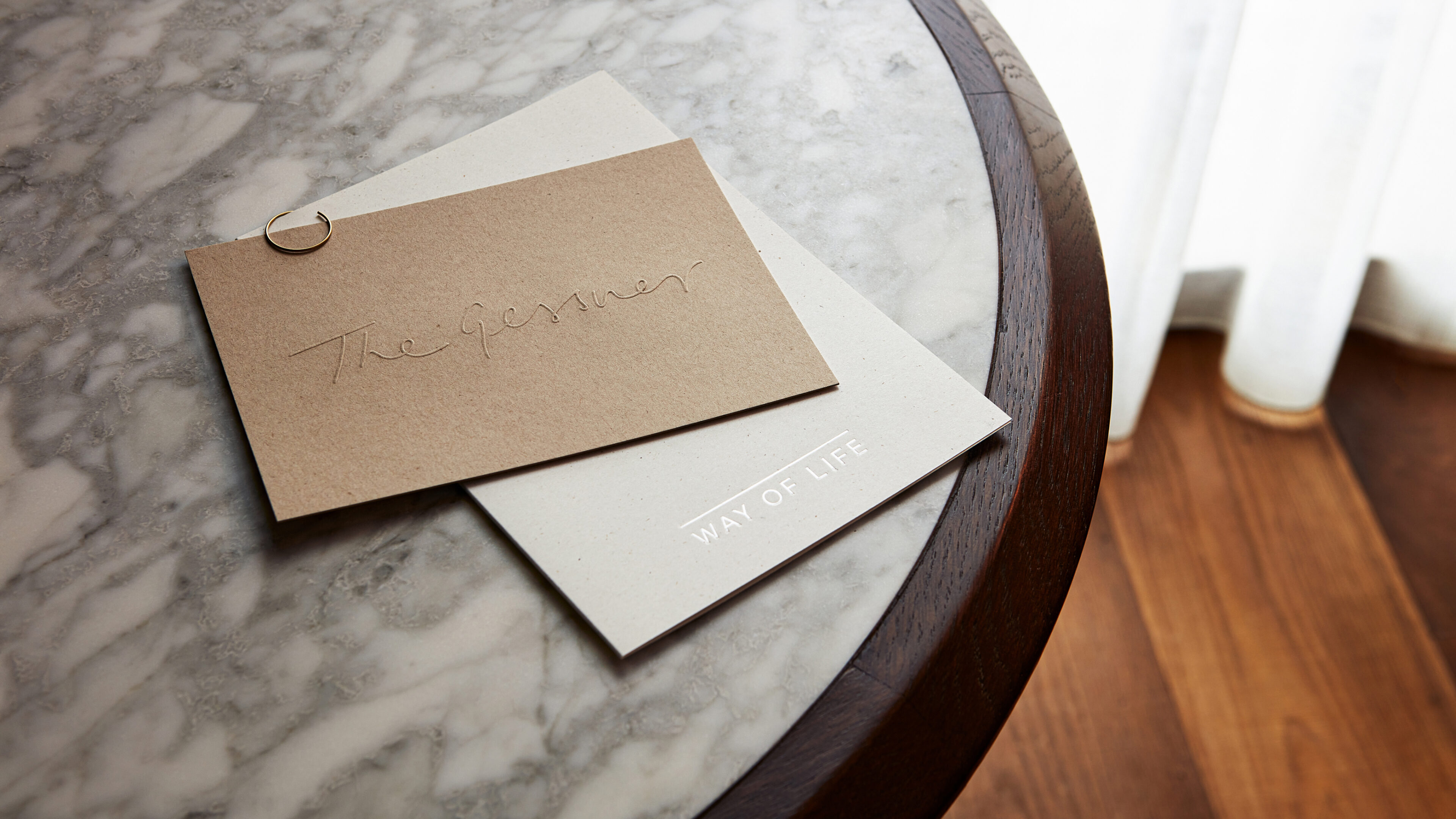
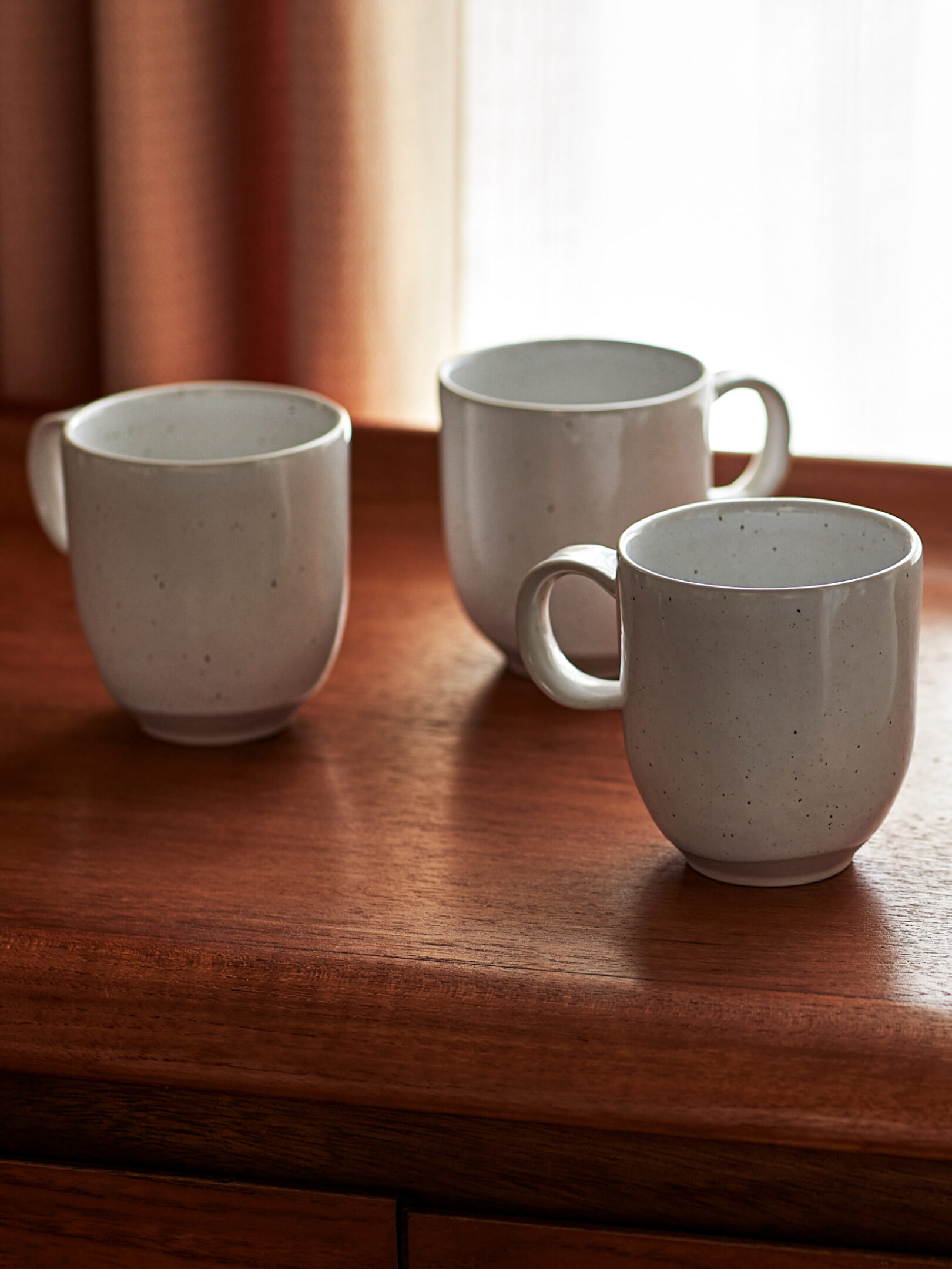
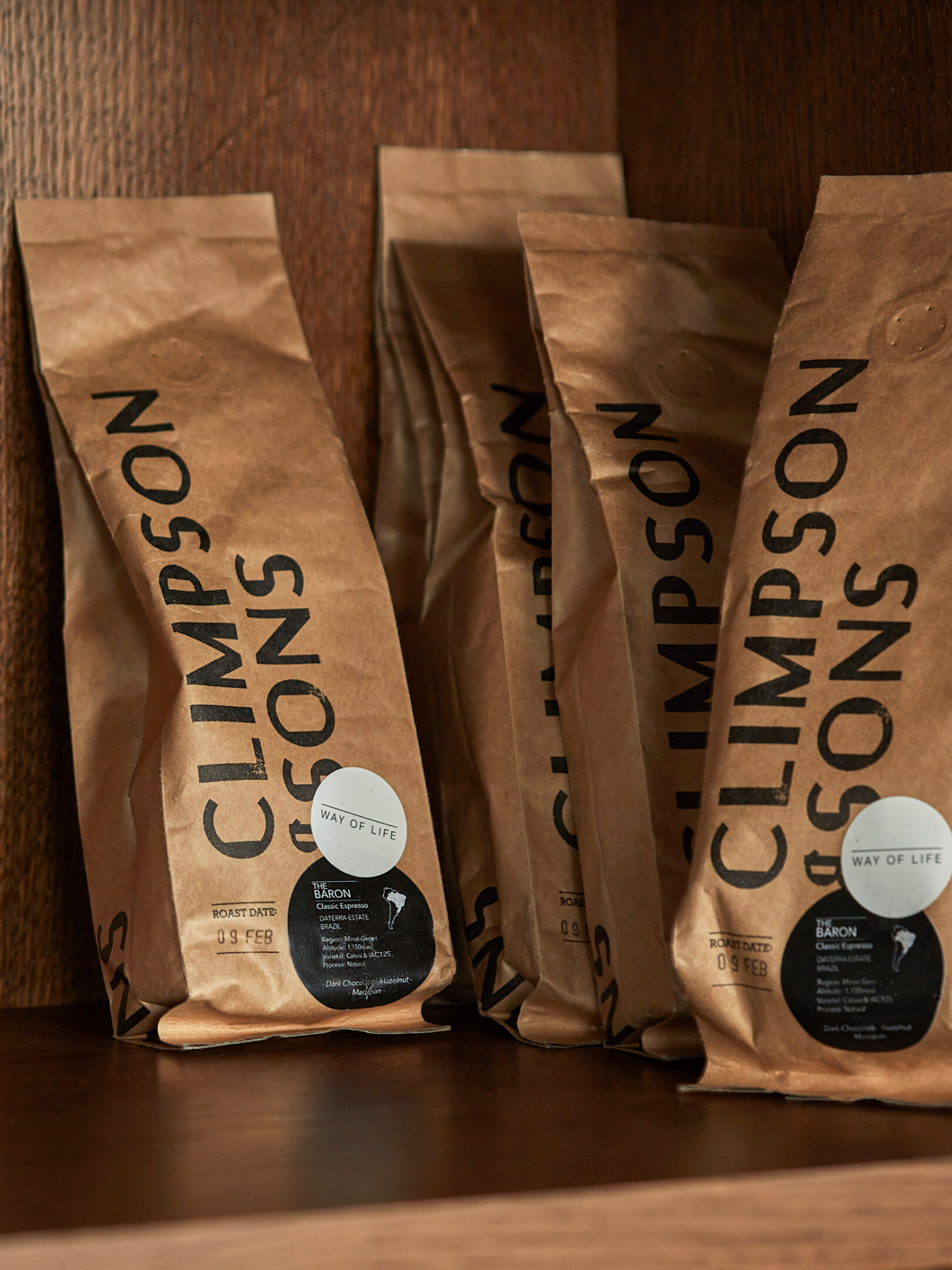
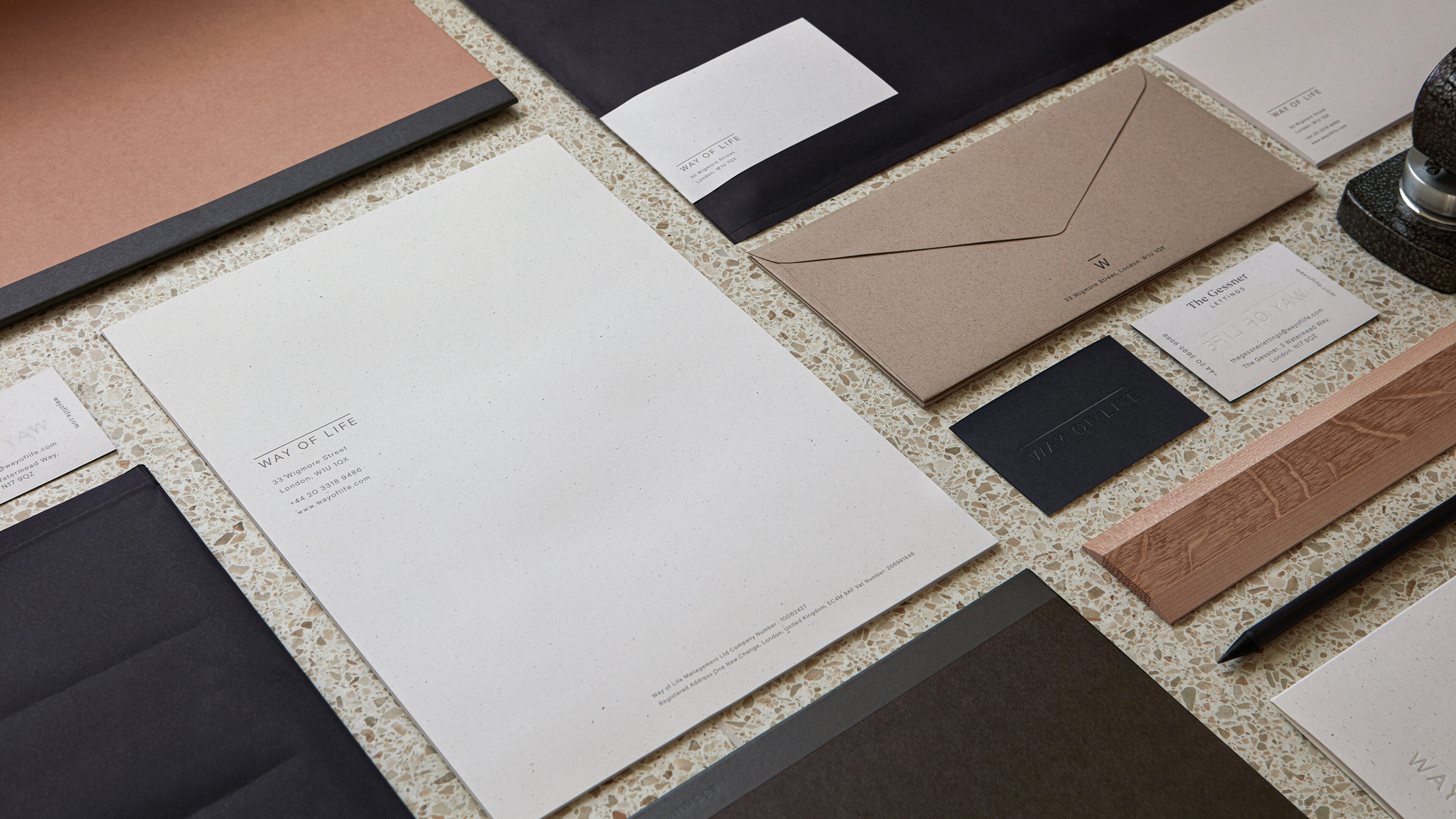
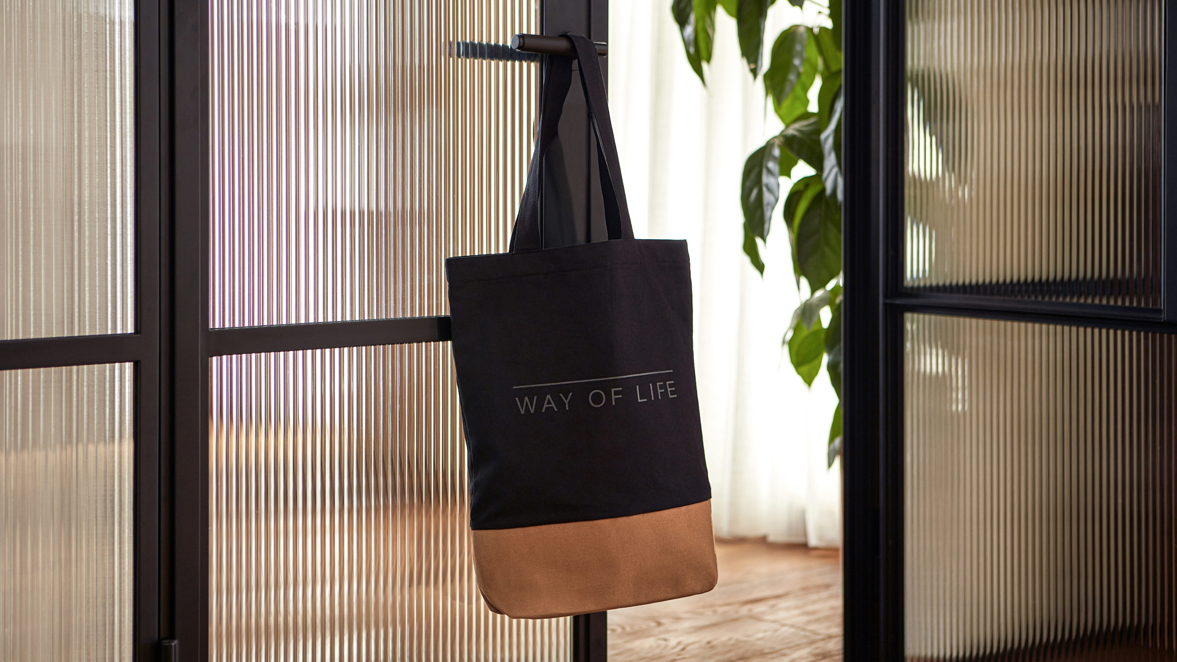
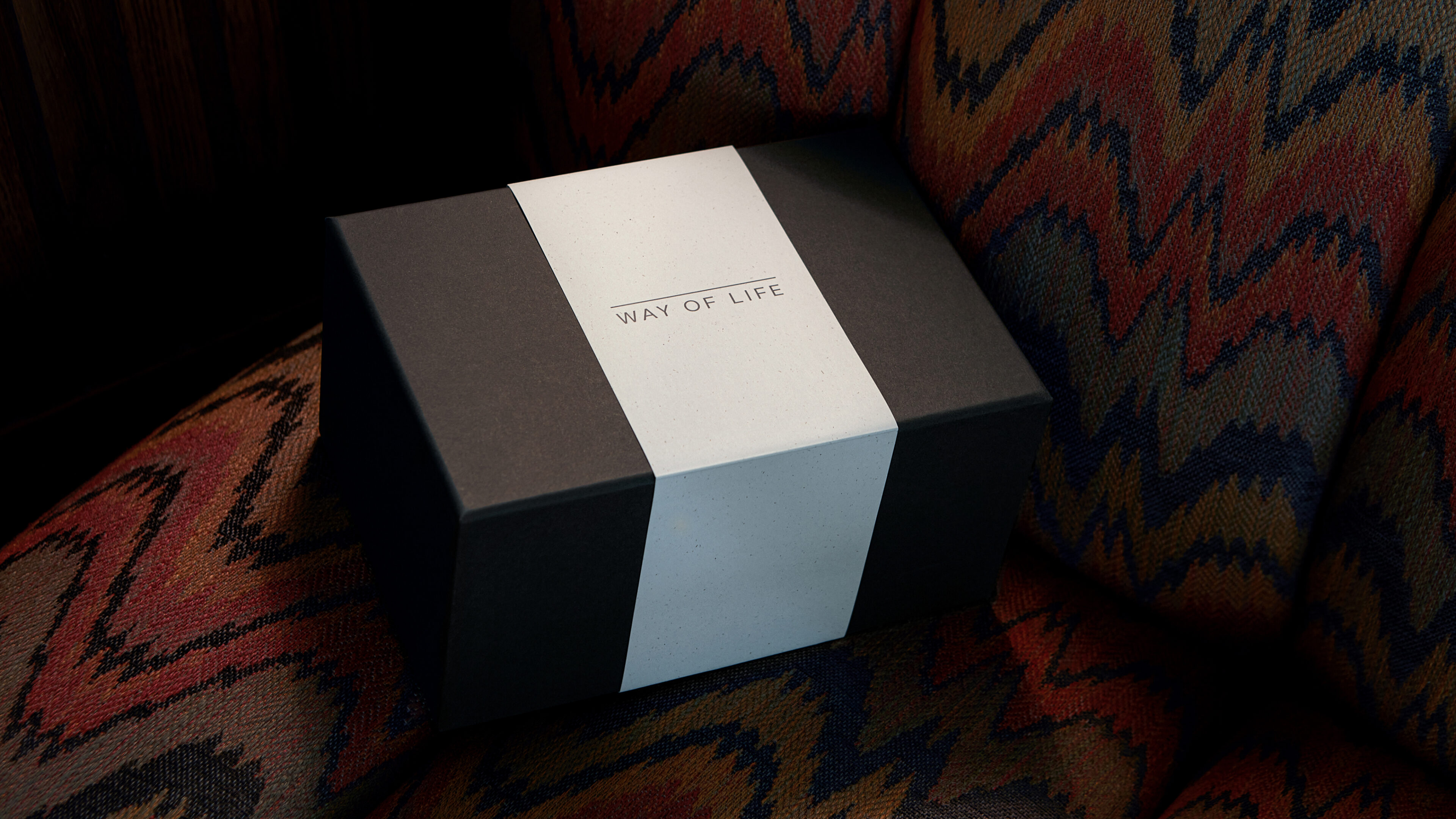
The materiality of the architecture was reflected in the welcome kit that we designed and produced for new residents. Each kit includes a set of two bespoke handcrafted mugs, a special collaboration bag of coffee and the new Way of Life tote bag.
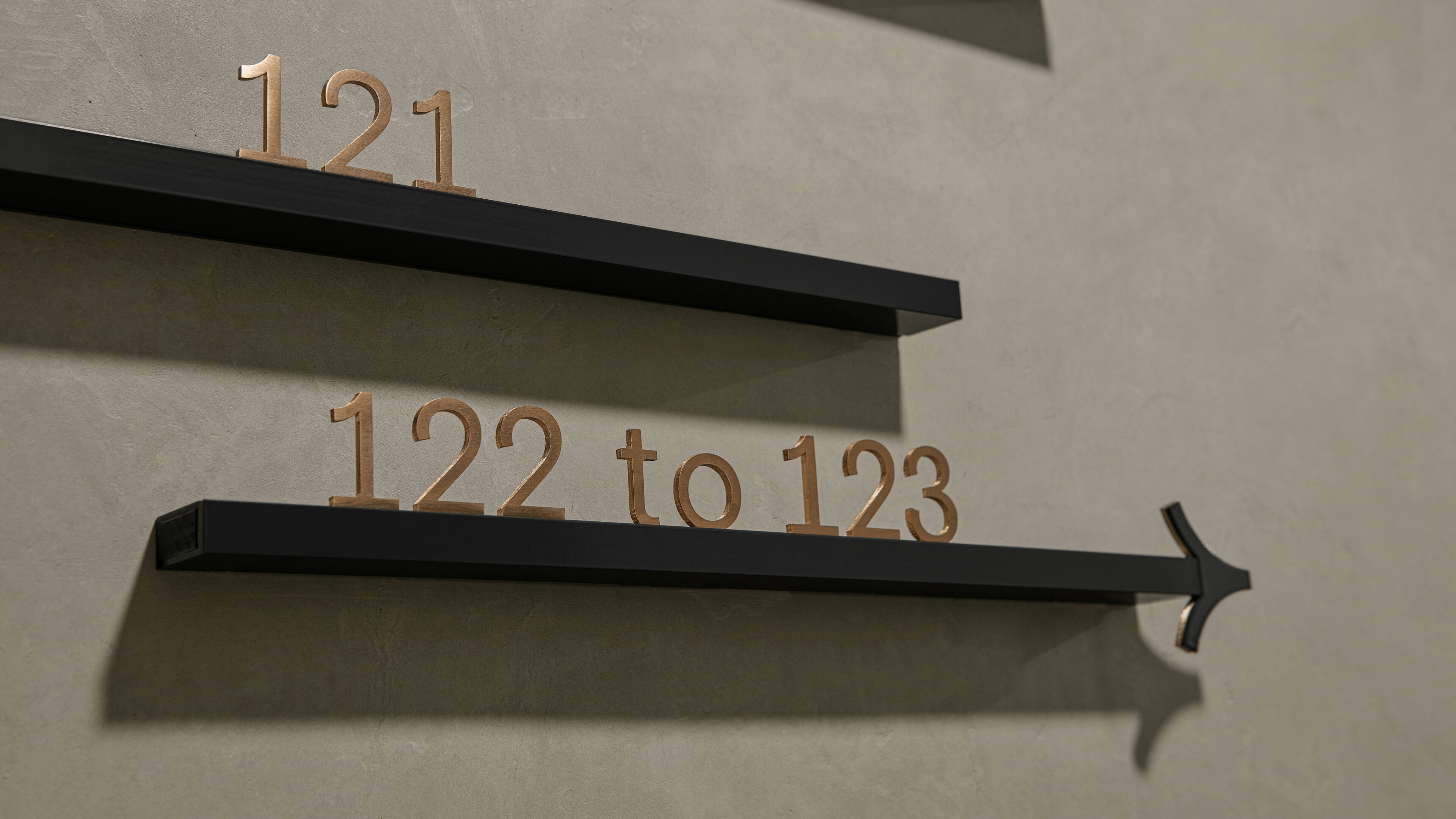
As part of the Way of life identity, we designed an understated modular wayfinding system that can be adapted to each new building. The suite of accompanying icons to signpost the different spaces and facilities is drawn from the logo’s linear foundation.
CLIENT
Way of Life SECTOR Architecture |
RELATED WORK
NoMoSu— A sugar-free first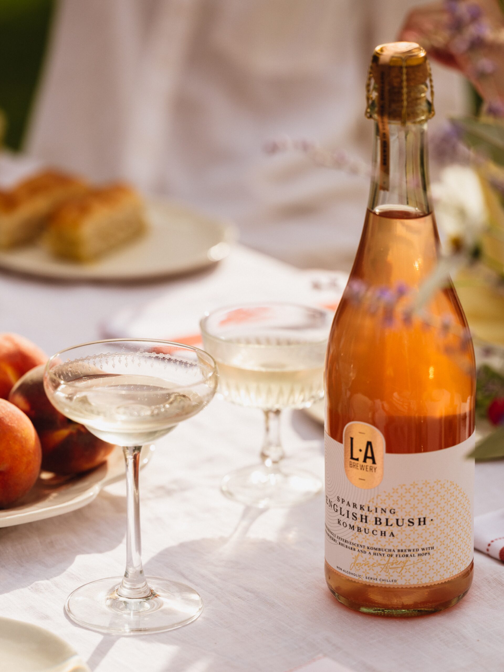
L.A Brewery— Opening up a world of luminous efferverscence |